Measuring the Impact of a Design System
A few days ago I was writing my bi-annual review, and I was thinking of how I could include some meaningful metrics about the success of our design system in Badoo.
It is undeniable that in the last six months Cosmos, the name we gave to it, has gained a lot of traction: everyone is mentioning Cosmos, everyone is starting to integrate or adopt Cosmos, there are even jokes around that if you have a problem, any problem, just open a ticket for Cosmos and it will be solved.
But this is not a metric. It’s really hard to measure people’s happiness, or the impact on how people work (and think) in term of UI, or the teams’ efficiency and velocity in delivering updates and new features to the product, and more in general the effect of a change in a complex system like a big company.
I know this is a very common problem in the world of Design Systems, and I know only a few examples of people that were able to collect data (see the references at the bottom of the page).
Personally, I tend to be wary of the idea that everything needs to be measured or it doesn’t exist, especially when things involve human beings:
In general, using only metrics to make decisions without using our brain, our heart, and sometimes even our gut, can be a double-edged sword.
But I totally get the point of view of someone who asks numbers about the benefits and results of a design system. Last year, when I was asked to provide some metrics, I had to come up with a form of a number, that was some kind of “UI coverage” of the pattern library. Essentially, I made an inventory of all the UI elements that composed the application, created a list of components and sub-components, and put them in a spreadsheet. For each one of them I assigned a status (“to do”, “in progress”, “to refine”, “done”) and some kind of “metric” (from 1 to 5) in term of effort required to produce that component (imagine some kind of story-points for estimates).
At this point I have defined a complex weighted formula, to compare the total of the points required to build the entire UI, and the points of the same components weighted on their status (1 if completed, 0.8 if to refine, 0.6 if in progress, and 0 if still to do). I have then split the formula in two, with slightly different ways to weight the components and sub-components, and their status. These two formulas produced two numbers, one more “optimistic” and a one more “pessimistic”.
This is how the final spreadsheet looks like:
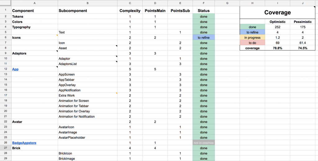
Unlike code coverage metrics that are based on objective elements, what we have here is a “measure” that is based on someone’s (me) perception, in this case the complexity required to implement a component. Clearly a subjective (and probably biased) metric.
Despite being such a synthetic metric, it can actually be used in a useful way: to track the progress in the work. People want to see progress, needs to see that things are moving, and this can give a clear indication of the “rate of change” in the underlying measured thing (in this case, how many components are added to the library, and how many are still left out).
When we plot the values of the UI coverage over time, this is what we obtain:
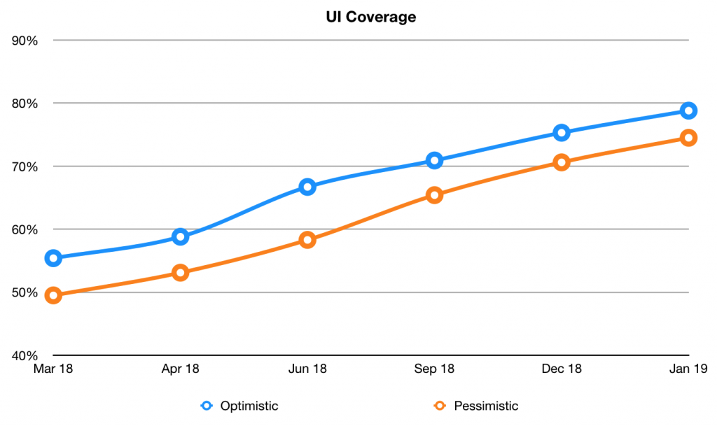
You can clearly see/read a few meaningful information here:
- first of all the trend: there is a constant and sensible growth in the number of components contained in the library, in less than one year we went from ~50% to ~80% of coverage
- the two formulas are converging, which means there’s less uncertainty
- we’re reaching a good coverage, around 80%, which — according to the Pareto principle (and Nathan Curtis’ wisdom) — means we’re left with a 20% of work that, potentially, may have a much lower ROI.
After this first attempt, I have tried to come up with other ideas for metrics, but they were all always qualitative, never quantitative.
For example, I’ve sent out an internal survey, to assess the opinions and the impact of Cosmos across different teams (designers, iOS/Android developers, web developers, product managers, QAs, etc). The results were great, beyond expectations, but still… people’s thoughts. No objective metrics, no numbers.
This was the question: “If you compare how you were working one/two years ago, and how you work today, do you think Cosmos has had any impact on your daily job? and in the job of the people you work with? if yes, what it’s been the impact?”) and even if I had answers like “less time wasted on discussions about pixel shifting and more time being productive” or “Faster design stage: everything now is like LEGO”, these could not be converted in numbers. There was nothing there that could be measured as a direct and exclusive effect of the design system. If I was a manager, I would have asked myself: “how much faster? can you give me a number? can you show me a correlation between the design system and the delivery of product features?”, and I would not have an answer.
So, since then, this has been my main (and only) metric.
Now, getting back at the beginning of this story. As I said, I was writing my bi-annual review, and thinking for other possible ways to show the impact of the design system on our company, when my brain made a strange connection with a conversation I was having a couple of days ago with one of my colleagues, about how many (and generally unknown) options git-log has.
I don’t know why, but I started to think: what if I can count the number of changes in our application’s codebase, limiting it only to the changes that are UI related, so changes to the CSS files, and in some way represent them on a time scale? What would I see? Would it be possible to observe some kind of effect (and possibly correlation) with a similar chart for the UI library codebase?
My gut feeling was that there was clearly a reduced amount of work in the team for the UI engineers (I am one of them), and that this was caused by the fact that we were not continuously writing new CSS at every new feature, but we were able to re-use and simply combine (“like Lego”) the existing UI components provided by Cosmos. And that this was also caused by the fact that also the mockups provided by the designers were more consistent, and followed a set of pre-defined patterns, so building UIs for us had become increasingly simple and straightforward.
But how to prove it?
I couldn’t help thinking about this, so I immediately started to play around the command line, trying to get something that I could use to extract the data. After a few quick tests, I ended up simply running this command in the application’s repo:
git log --stat --reverse --date=short -- 'src/css/*.less' > ~/git-log-stats/data-raw/logs_less.txt
This command goes through the entire git history, and extracts all the commits information that involve changes to the LESS files (we moved from LESS to Sass a couple of years ago, so I had to do the same for Sass files, and merge the logs).
I run the command for both the application’s codebase and the Cosmos codebase, and saved the resulted output in separate text files.
If we take a sample of this output, we would see something like this:
commit 13f68a70e9fd483f22b527ea63f288e8f4ab4f33
Author: Name Surname <name.surname@email.com>
Date:   2014-12-05    [MW-****]: restored the clear button    src/css/v2/elements/forms.less | 12 ++++++++++++
    src/css/v2/modules/header.less |  2 +-
    2 files changed, 13 insertions(+), 1 deletion(-)commit 303c5cbd8c70c1932d0fa517cb2ca60783c6fce7
Merge: e16b0d0548 c36113c1ca
Author: Name Surname <name.surname@email.com>
Date:   2014-12-10    [MW-****]: Merge remote-tracking branch 'origin/master' into MW-****_restore_clear_button...
The information I was looking for was all there: the date of the commits, the number of files changed, and especially the number of lines of code added and/or removed with that change (only for LESS/Sass files).
I then looked for a git-log parser, found a simple one in Python, ported it to JavaScript, and what I ended up with was a Node-based parser/processor (you can see the code here on this gist) that takes the output of these commands as text files and generates huge JSON files containing a list of all changes aggregated per day.
This is what a section of a JSON file would look like:
    {
        "date": "2014-12-05",
        "files": 2,
        "insertions": 13,
        "deletions": 1
    },
    {
        "date": "2014-12-06",
        "files": 10,
        "insertions": 120,
        "deletions": 60
    },    ...
Finally, I took the data generated by the script and used it to create a visualisation of these numbers using the D3.js library.
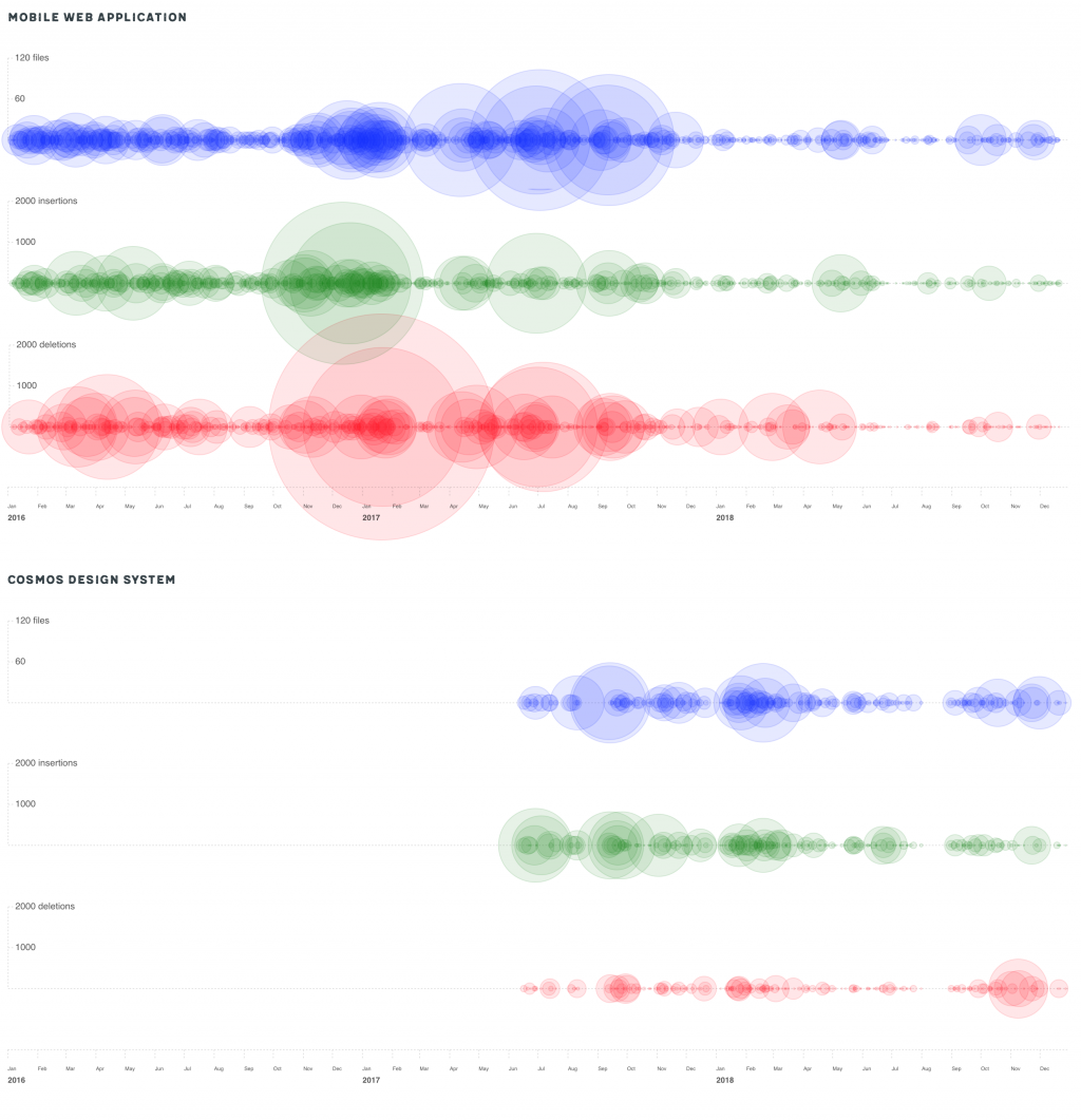
The first thing that came to my mind was to draw “bubbles” along a timeline, where the radius of the bubble was the value to plot.
As soon as I generated the chart, my mind was blown away. Everything I imagined was there! Looking at the chart for the application’s codebase, there was clearly a before and after, a series of medium/large bubbles followed by a series of small bubbles; and this was consistent with the second chart, for the design system component library.
There was so much to read in this chart!
When compared, the changes in the main application codebase and the changes in the component library codebase showed a clear and evident correlation: since the introduction of the design system, and the adoption of the UI components from the library into the application, the amount of changes has significantly reduced. Which means much less work for the UI engineers (or, I would say, better work, with more time to spend on the quality of the application, which has improved constantly in the last years).
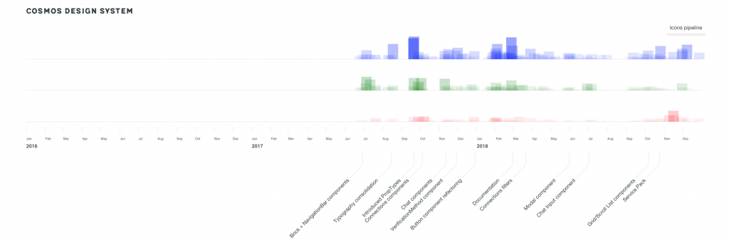
The reduction of work on the main application was not countered by an equal amount of work in the component library (otherwise it would have been just a zero-sum game!). If you notice, on average the size of the bubbles in Cosmos is much smaller than the size of the bubbles in the application. This is a clear effect of the fact that components are “added once, used forever. If you look at the annotated chart below, you will see that these bubbles match with the implementation of specific components (they are just new components added to the library) and the cost of their maintenance is negligible (tiny bubbles).
There was still one thing puzzling me: in reality, this representation was not 100% correct. The measures are plotted as radius, but we perceive them as areas (“bubbles”), so the fact that they are not linear but quadratic may induce some kind of bias or over-estimation of the effect.
So I decided to try another form of visualisation: to use just simple rectangles, with the height of the rectangle directly proportional to the value plotted and the width a fixed size. In this way, the measures were linear and proportional.
The results were now even more clear:
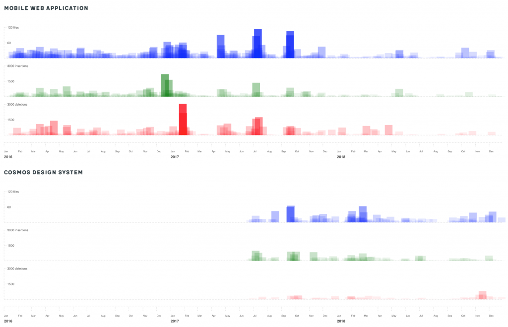
What this representation made more visible were different patterns in the way the changes were applied to the main codebase:
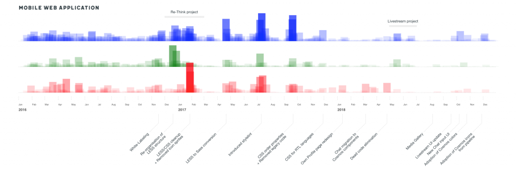
- in the first months of 2016 there was a phase of many and very frequent medium-sized changes (true: this corresponds to a phase of evolution and settling of the CSS codebase: we introduced a style-guide and started to componentize more and more the UI);
- between the end of 2016 and 2017 a period of big massive changes (true: it was when we worked on a complete redesign of the entire application, a project called Re-Think);
- then in 2017 there were three big peaks, corresponding to three big re-factorings of the code (in fact, we moved from LESS to Sass, we introduced stylelint, and we enforced the order of CSS properties);
- in the last part of 2017 and for the whole 2018, only relatively small and isolated changes, with some more evident groups of changes here and there (we introduced a new complex feature called Livestream in our application, we completely removed all the SVG icons in the codebase).
Just changing the type of visualisation, suddenly uncovered a secondary measure that was somehow hidden in the noise of the circles: not only the amount of change, but also the frequency of change was a meaningful metric. And this was now clearly visible: the more rectangles are drawn one near the other — which means the more “dense”, frequent are the changes in time — the more opaque is the painted area in that space of time (keep in mind that the opacity of the single rectangle is a fixed value).
This effect is even more evident when we compress the horizontal scale:
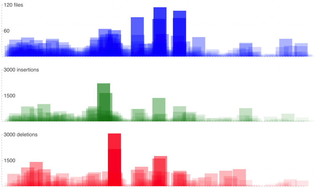
In this case, the areas on the left get more opaque, while the areas on the right remains relatively transparent. This means that on the left we have many frequent medium/large changes, on the right infrequent small changes.
Which was exactly what I was experiencing in my day to day work. Seeing it there, in plain sight and in such an incontrovertible way, it was… wow!
What is the next step, you will probably ask. Are you going to convert this to a “proper” metric, to a number that you can use and monitor over time? Well, my answer is: no. For two main reasons.
First, because that would be like measuring the “number of lines committed per day” or the “number of tickets closed per month”, and this is a really bad way to measure something (generally, productivity). When humans are involved, not everything can be measured.
Second, because I don’t want to pass the idea that “a design system makes people work less”. If you’re reading this in the charts above, well let me tell you’re completely wrong. The reason for introducing a design system in a company is not because so people can work less, but because so people can work better. I want people to focus on the important things, and reduce the amount of repetitive work they do.
I know from experience how hard it is to measure the impact of a design system on a company, a business, a team. That’s why I’ve shared my little experiment: in the hope that it can be useful to someone else, that can inspire someone else to find their own “meaningful metrics”, and share them in turn.
We need more and more examples of possible metrics for a design system, and real-world examples of what positive impact a design system can have. We know it’s there, we see it day by day, with our own eyes: we just need the numbers (or the coloured charts, in this case) to demonstrate it.
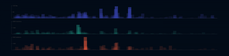
Below is an annotated version of the charts, with some extra information about what those peaks mean. I know many of the things you see there will mean little or nothing to you, but trust me, they make a lot of sense for the people involved in these codebases :)
Resources
Some interesting links about the introduction of metrics in design systems:
- Nathan Curtis on measuring design system success using OKRs to set goals and track progress
- Jeroen Ransijn on measuring the adoption of their design system at Segment (see The Component Usage Treemap)
- Varya Stepanova on automatic collection of quantitative data about components usage at Elisa
- Daniel O’Connor on tracking key quantitative metrics and qualitative feedback over time
- Diana Mounter on how they measure the success of their design system at GitHub
- Joshua Sortino and Jina Anne share a few tips on how to measure the impact of a design system
- Bryn Ray has made an interesting and detailed analysis of much is a design system worth
- Lily Dart in a presentation about their Constellation design system at the Lloyds Banking Group, said that the design system saved their teams £190.000 per project (!), and that overall has already saved the group more than £3.5M. That’s a really impressive metric!
- Dan Mall of SuperFriendly in his article about “Selling Design Systems” mentions the case of their customer, the Adventist church, who decided to “measure what they do” and define specific OKRs (see #1, #2 and #3).
- Rauno Freiberg of Veriff has written a post about measuring the impact of a design system using a different kind of metric (usage of components):
https://www.veriff.com/veriff-times/measuring-impact-design-system - Anja Klüver has recently given an amazing talk at London Design Systems conf, about making the case for a design system with stakeholder and how to give meaningful numbers about costs, savings and ROI of a design system. You can watch her talk here: https://www.youtube.com/watch?v=v8i1qeCv2IQ. You can also view a few slides and a small Twitter thread here.
- Christos Kastritis has published an article explaining how he started to measure the impact and adoption of the design system at Deliveroo, and in particular how to use Figma’s analytics to extract valuable data: https://medium.com/deliveroo-design/how-to-understand-your-design-systems-health-and-eventually-its-success-9cbcdae13a2f
If you have more examples or links on this topic, please share them in the comments to this post and I’ll add them to the list.
Originally published on Medium on January 29, 2019