Industry Conf 2016
An unexpected conference in Newcastle

Last year – I don’t remember how – I came across this conference that I’ve never heard of before, called Industry Conf: the practical web conference.
I think it was through one of the videos made available on their website, while looking for some speaker’s background doing “scouting” for Codemotion. Anyway, I clearly remember that as soon as I looked at the lineup, the talks and especially the quality of the topics chosen, I said to myself: “you can’t miss the next one”. And so I didn’t (I think mine was the ticket number one, this year).
Today I had the chance to spend the whole day in Newcastle (a lovely city, by the way) and attend my first (and probably last, you will see later why) Industry Conf.
This is an unusual conference, at least for me. Is organised by a one-man-band, Gavin Elliott, who did an incredible job. If you have ever organised an event like this, you will know how much effort, energy, time, stress (and personal life) goes on behind the scenes, that nobody sees. Doing it all on your own is superhuman.
Kudos and props to you Gavin, what you have achieved is simply extraordinary.
I loved what he mentioned in his closing speech, about the reason that pushed him in doing this: “to give back” to the community. Those who know me, know how much I care about this. So it’s from the deep of my heart that I say “thank you”.
And ‘community’, together with ‘needs’, ‘psychology’ and ‘feelings’, was one of the recurring words during the day, across the talks and the conversations.
And this came quite unexpected to me too. I had some expectations about Industry Conf, being a “tech” conference, that were completely blown away. Most of the talks were about humans, not simply tools or technologies.
Each talk surprised me, amazed me, provoked me, made me think. Most important for me, none of them was an “already seen that” talk. Some resonated more with me, some other less. But the quality of the content was absolutely high level for all of them.
Clearly every talk was carefully selected and precisely chosen by Gavin. And this is what I like in a conference: an authorship, an editorial line that gives a clear direction to what contents are presented, by who and even in which order during the day.
Below you can find some notes I have taken during the talks. They are pretty raw and bare and definitely not exhaustive, but can give a good hint of the main points of the speakers’ presentations. Also, I have avoided to add my thoughts or opinions, I don’t think are necessary in this case.
Jennifer Brooks – Relationship Advice for Your App
Artist and independent designer
@jenniferbrook – jenniferbrook.co
How do we create a relationship with our customers, audience, communities?
You don’t need only the skills of a designer or researcher, but also of a therapist and a detective.
Challenge of inter-relationships at scale. Users interact with systems, apps, interfaces, software: not you.
At the base of everything there are human needs: love, meaning, safety, to know and be known, etc. so you need strategies.
“I need a cake”. The cake is not a strategy: the need of joy or nourishment is the strategy. As a UX designer, you need to convert the language, unpack and pack back the needs. You have to get to the root, to define the correct strategy to satisfy the needs. Because there are many strategies, but different needs can lead to conflicts, if they don’t share the same ultimate need:
[I want pizza + you want cake] = conflict => [I want pizza for freedom + you want cake for joy] = we can share the strategy
Feelings are the interface to needs. Needs <-> Feelings <-> Strategies.
Needs live at the core of every human system. And human systems are complex.
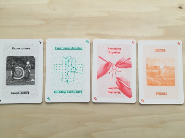
Some of the tools that I use:
– Empathy Map (Do/Feel/Think) to get the feeling of the team
– HEART Framework (Happines/Engagement/Adoption/Retention/Task success) –
– Co-creation deck of cards
Asking questions is at the base of our work. But *how* we ask matters.
Listen with guts. Because we are working with feelings. Empathy is important.
Become fluent in feelings, because feelings are the key to the real needs.
Stephanie Rewis – Flexing your layout muscles
Lead Developer, Design Systems at Salesforce
@stefsull
position: absolute is great for certain things, but not for layout.
display: inline-block is very handy, but has the whitespace problem.
display: table is for tables, not layouts (unless you live in 2001)
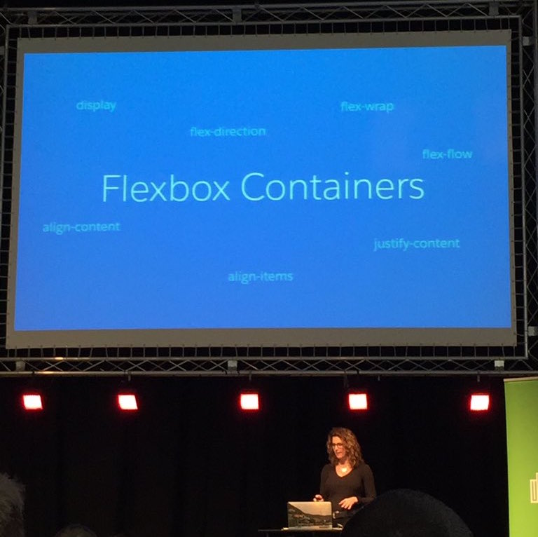
and here we come at using display: flex for layouts.
Browser support is very good, and fallback works nicely.
Flexbox containers / Flex items – overview of their properties
Notice: use “order” cautiously: Firefox and Chrome/Safari read the DOM in different ways/order, so for accessibility can be a problem.
Some examples of flexbox applications:
– equal height columns (without the “faux columns” technique)
– align to the bottom (e.g. a sticky footer)
– absolute vertical centering (the holy-grail of the CSS)
simplest version is .container { display: flex; } and .item { margin: auto; }
Some examples of other applications
– horizontal lists
– grids (brid base + grid utility)
Rian Van der Merwe – User Research: challenges and solutions for the Enterprise
Designer, Product Manager at Wildbit, Portland USA
@rianVDM
Slides of the talk are available here: http://www.elezea.com/2016/04/talk-slides-user-research-challenges-solutions-enterprise/
How to introduce user-research in a corporate, large organisation, in an enterprise project?
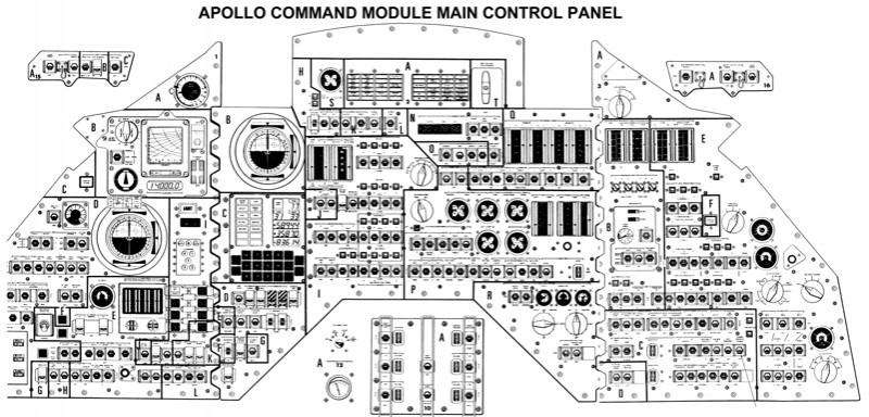
Space mission to land on the moon is the archetype of an enterprise project: impossible deadlines, limited budgets, crazy requirements.
The controls panel inside the lunar command module is the anti-pattern of UI design.
User research can move the focus from the company “needs” (HiPPO effect) to the “user needs” and “biz needs”.
The business case for doing user-research
1) “It costs a lot and takes too much time”:
– user research can shrink to the budget/availability (can be large or small)
– what happens if we *don’t* do user research? what is the cost of *not* doing it, of building products without research?
2) “We know what is the best”
– waterfall / silos / bureaucracy
Solution is “discovery-based planning”: assume that forecasts are wrong, rathen than right, unless proven.
3) “We know enough about our users”
Design projects that neglect research fail not because of lack of knowledge, but because of lack of *shared* knowledge
How to sell the value of user-research in enterprise:
– increased revenues (design-focused companies are performing 219% better than the other companies)
– reduced costs (cost of making changes during design is 1x, during development is 6x, after lunch is 100x – from book Software Engineering: a practitioner’s approach)
– faster development cycles: if user-research makes things slower, you are doing it the wrong way; in reality doing user-research exposes the “big rocks” (the big problems, the big unknowns) way much earlier in the product development, when we are in the information-architecture/content-strategy and prototyping phases.
How to improve insight generation of user research:
– plan for the non-buyers: when you get the results of the research give them to the sale team too, not only the people that will use the data, so that you create a positive loop about the value of user research
– write a short research plan: background, methodology and schedule, goals and outcomes
– focus on core research methods: useful = utility + usability; evaluate utility doing exploratory research to uncover unmet needs (fields visits, concept testing, participatory design); evaluate usability doing user testing
– record and document to “show” that is scientific (it’s enough a couple of photos of real users, and everything gains an halo of “scientific method”)
– show your work: boards, mind-maps, charts, etc.
Free Book: Practical User Research in UX Enterprise (PDF)
Jonah Jones – Lessons learned from building a collaborative video app
Product Design Manager at Facebook, London
jonahjones.co.uk
What is usability?
– Effectiveness, efficiency and satisfaction ina specific context”
– how easy are interfaces to use (Jakob Nielsen)
Today we will talk about “phsycological usability”:
Sharing:
Facebook mission: “Give people the power to share” (“and make the world more open and connected”, but my team focuses on the first part).
There is a funnel in this aim: Reality => Captured => Shared => Ranked/Seen
Barriers to sharing
– velocity, technology
– psychological barriers are: audience (one to one, one to some, one to many: changes the audience, changes the likelihood that you want to control what you say/share); quality of content (considering Facebook ranking algorithms); context that makes something appropriate or inappropriate
Innovation
Step change – a big change to an app – is a very risk strategy, people don’t like change. So that’s why big companies prefer an incremental change; but even in that case it’s complex because you may need many steps before making an actual perceivable change.
So Facebook created a “Creative Labs” departments, that do step changes, test them and when they show to be successfull they are applied to the actual product as incremental changes.
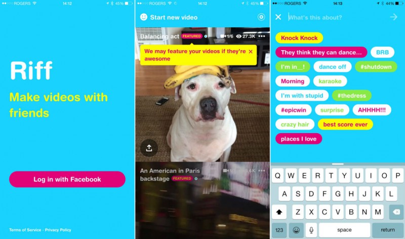
The story of Riff
Video is very powerful, as a medium. But people will have a lot of questions and barriers that will stop them to record and share a video (what will people think of me? what do I have to say? will I embaress myself?)
Ice Bucket Challenge was a massive spike in people sharing videos. Silly and fun, but everybody shared videos. What was the reasons of this success, why it overcome the psychological barriers? Audience is not a problem, the broader the better; quality: no need for it, also because there is a 24h window of time; context is clear, everybody knows.
What we can learn from this? What if we can make things in a similar way?
The first design we came out with was setting the tone of the application to be a serious, sleek, modern app. It was dog-feeded internally, but we noticed people shared only “serious” videos (this is my cool dinner, this is my cool travel, etc)
Second design was completely different: more fun, more friendly. This lead people to share more content because the psychological barrier was lower.
Lessons learned
– set the tone with the UI
– have a clear purpose
– remove the psychological barriers
In conclusion: usability is more than pixels on the screen, consider the psychological aspects too.
[The Riff app has been removed from the store, it’s been an experiment of the “Creative Labs”]
Wes Bos – Start using ES6 today
Full stack JavaScript developer, speaker and teacher from Canada
@wesbos – wesbos.com
Slides of the talk are available here: http://wesbos.github.io/ES6-Talk/
Life makers: features tha make life soooo much better
– LET and CONST instead of VAR to declare variables. They are block scoped (code examples with let in a for loop). Notice: CONST is not immutable (e.g. when the variable is an object, you can update its properties)
– BACKTICKS (`) for concatenating strings. Inside the evaluation you can run JS operations or functions. Vary handy to create HTML template strings, and fill it with values and even functions and nested template strings!
– DEFAULT FUNCTION ARGUMENTS
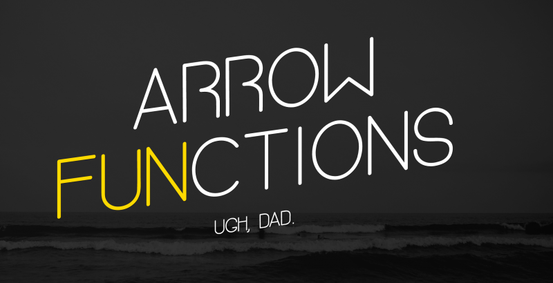
– ARROW FUNCTIONS are not only syntactic sugar: implicit argument (single), implicit return; the value of “this” is the parent’s value
– ENHANCED OBJECT LITERALS
– METHOD DEFINITION
Tooling:
– transpiling with Babel
– new features can be polyfilled (not all of them)
Deep end: new concepts for programmers
– DESTRUCTURING allows to create multiple values in a single line of code. can go deep in the object structure and it works also with arrays (using the indexes, not the properties). you can also rename while destructuring, or swap. you can also use it to return multiple values from a function
– SETS are arrays with unique data (so you don’t need to check if something already is in an array, or add it otherwise). it has a nice API: size/has/add/delete/clear. is easy to loop on using “for in”
And we are only scratching the surface!
Beth Dean – Emotional intelligence in design
Illustrator and designer in Facebook, San Francisco
@bethdean – thebethdean.com
A talk about the relationship between software and feelings. Impossible to describe with words (update: not necessarely). Fantastic talk (and amazing speaker). When the video will be made available, I will link it here.
Personally I would have loved to see Beth Dean’s talk as opening keynote, because it was a-m-a-z-i-n-g, but that’s just a matter of personal taste :)
Caroline Jarrett – How to look at a form
Leading user experience and usability consultant, UK Gov Digital Service (GDS).
@cjforms
Some examples of forms, let’s look at them and try to analyse them:
– Paying for a parking ticket: what happens if you have lost the ticket?
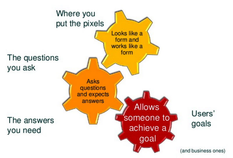
What we learned: Forms are conversations, not only boxes to fill, that should allow someone to achieve a goal. They touch different disciplines: Interaction Design, Content Design and Service Design. They should fulfill user’s needs (and also business ones).
What is a good form made of:
– Appearance: easy to use and to read.
– Conversation: easy to understand and to answer
– Relationship: easy to get it done and move on
So how to look at it?
1) don’t look at it (yet)
2) choose a persona and write a little story of why the persona is filling in the form (write down your assumptions)
3) fill in the form, as that persona, as honestly as you can (keep notes)
4) now, only now, do look at it: how does it look through the three layers?
5) do user research: test your assumptions
Open panel with the speakers:
What is design? Design is awareness. It goes beyond the simple tools you use. It’s about making great decisions.
Why we don’t see so many C-level roles (CEO, CTO, etc.)? Because is a very immature industry, and the need of design (in its broader meaning and meaning) is not yet fully perceived, and valued as differentiating element.
What is Front-End Development? It’s whatever you want to make it.
Visual Designer, Interaction Designer, UX Designer, Service Designer. What next? At Facebook everyone is “Product Designer”, there is no specialisation in the job title. And this is very effective (also from the recruiting side).
Gavin Elliott, closing speech
Lead Interaction Designer at DigitalDWP and organiser of Industry Conf
@gavinelliott – gavinelliott.co.uk
All of this has been done to “give back”. But this is the last edition. This is the *real* end.

Link: https://industryconf.com