From zero to Cosmos — Part #1
First part: where everything started, and where I reaped the fruits of my labour
This is the story of how a small style guide that was first introduced under the radar, became so appreciated by both developers and designers that it eventually became a complex unification project — a design system called Cosmos.
From zero to Cosmos — Part #2
From zero to Cosmos — Part #3
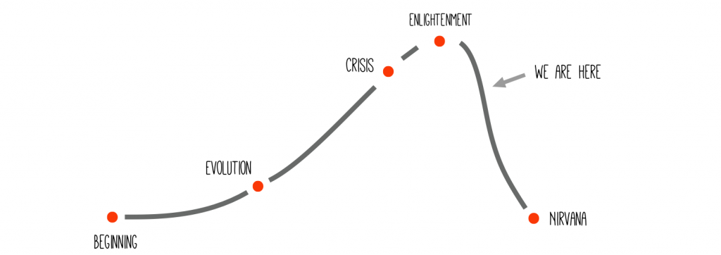
As some of you may know, every good story follows a classic narrative structure, called the story arc, or the “Hero’s journey”.
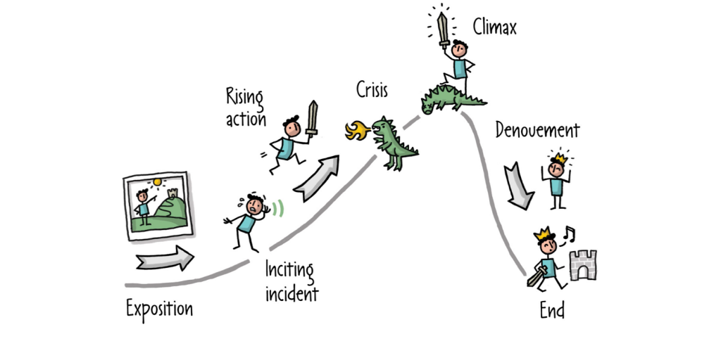
Well, it just so happens that my story follows exactly this perfect path. So, this is the summary of my story:
One final note, before beginning this journey: please keep in mind that what I am telling you is from my personal point of view, the point of view of a developer, and not necessarily from the point of view of a designer (I think and hope that the designers who worked with me on this project will soon have time to share their experiences and learnings).
Dramatis Personae
But first of all, let me introduce myself and Badoo, the company I work for and where this story is set.
My name is Cristiano Rastelli and I am a UI Engineer.
I work in the Mobile Web team in Badoo (which means, I work with any possible browser on every possible device). In the last two years, I have introduced first a Style Guide and then a Visual Regression Testing suite for this company, and later I started to implement a proper Design System.
I’m in love with Atomic Design, Design Systems, Web Components, and CSS and Front-End architecture. I like to work at the intersection of business, design and development. I’m also an eager attendee and organiser of technical conferences and meet-ups, and sometimes also a speaker.
As I said before, I work in Badoo, the largest “social discovery network” in the world with more than 350 million users across the globe.
Now, just to give you an idea of the different sizes of the teams, here is a schema of our organisation (I have omitted the business areas that are not relevant to this story):
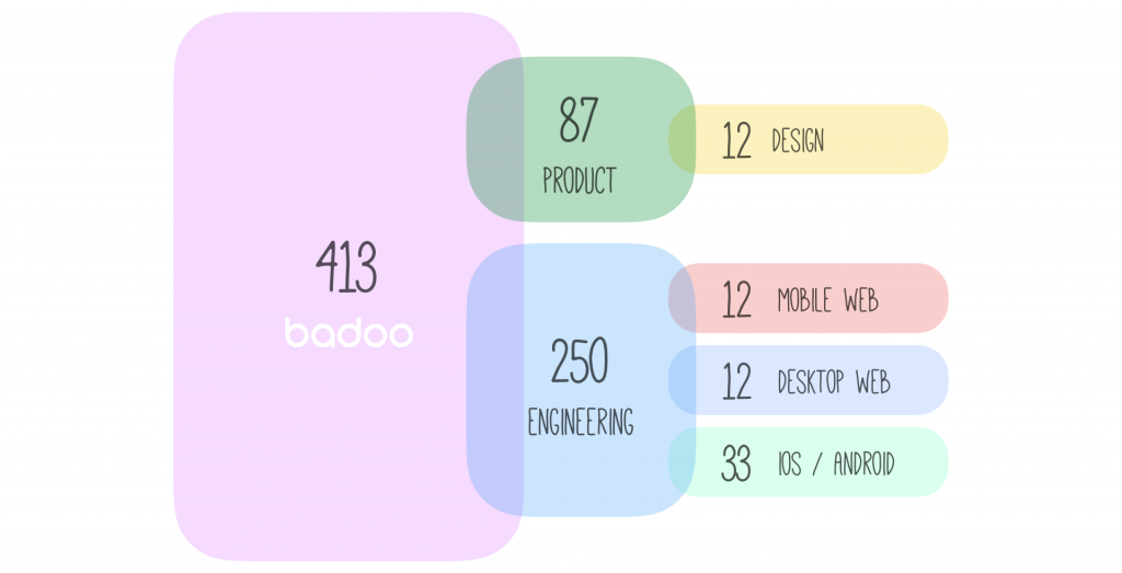
As you can see, we have a product with a huge number of users, but actually, the sizes of the teams are relatively small, compared to companies with similar user bases.
And only a handful of people work on the design system itself.
But let’s go back to the very beginning of this story, in early 2016, when I joined the company.

Under the radar
After a few weeks working in the Mobile Web team, looking at the codebase, I realised that there were no signs of components, of reusable code, no idea of modularity or a “single source of truth”.
At that time, in the team, there was almost no knowledge of the principles of Brad Frost’s Atomic Design, and the word “component” was rarely used, if not at all.
The designers’ handovers were “static” files, perfectly handcrafted deliverables, and there was nothing wrong about them. They’re fantastic designers, and I’ve never worked so well in a company before.
But given our fast design cycles and our strong A/B testing, given how our workflow and backlog pipelines work (each team/platform may work on the same feature at different moments in time) it may happen –and has happened–that some UI elements in the designs were not yet in production, while others were already outdated, once the developers picked up the task from the backlog.
Often, the designers started from an existing file to design a new screen or flow, but this file in the meantime could have become outdated, and so the developer needed to double check every time with the product managers and the designers what was the actual, current design of a feature or a screen.
This caused a lot of overhead and extra work for both the designers and the UI developers.
At this point I made a decision: we needed a style guide. I already had experience in building style guides in my previous jobs, and so it was relatively easy for me to start on this one.
I started small & lean, working incrementally. Every feature ticket I was working on, I was adding new components to the style guide, or converting existing patterns to them.
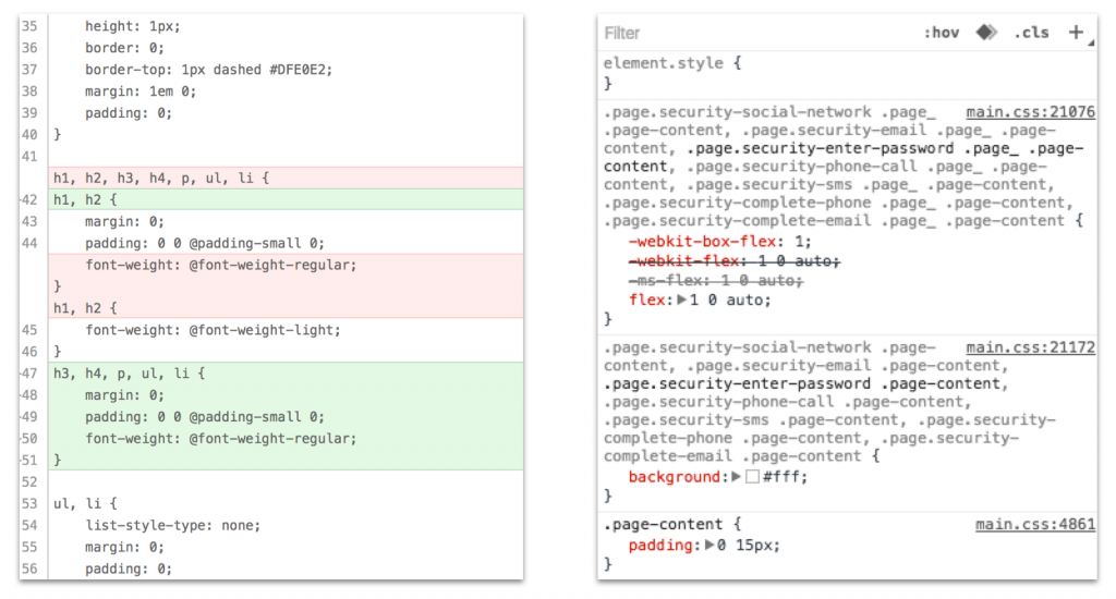
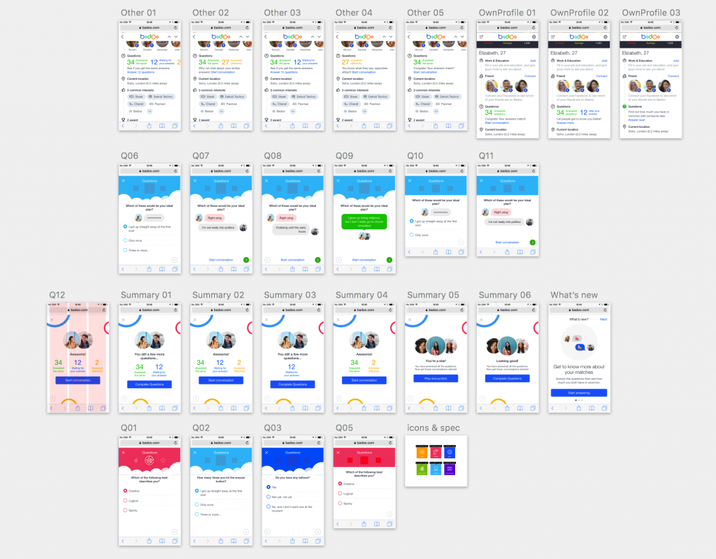
One ticket at the time, one component at a time, with little noticeable overhead, I created the first style guide for the Mobile Web application:
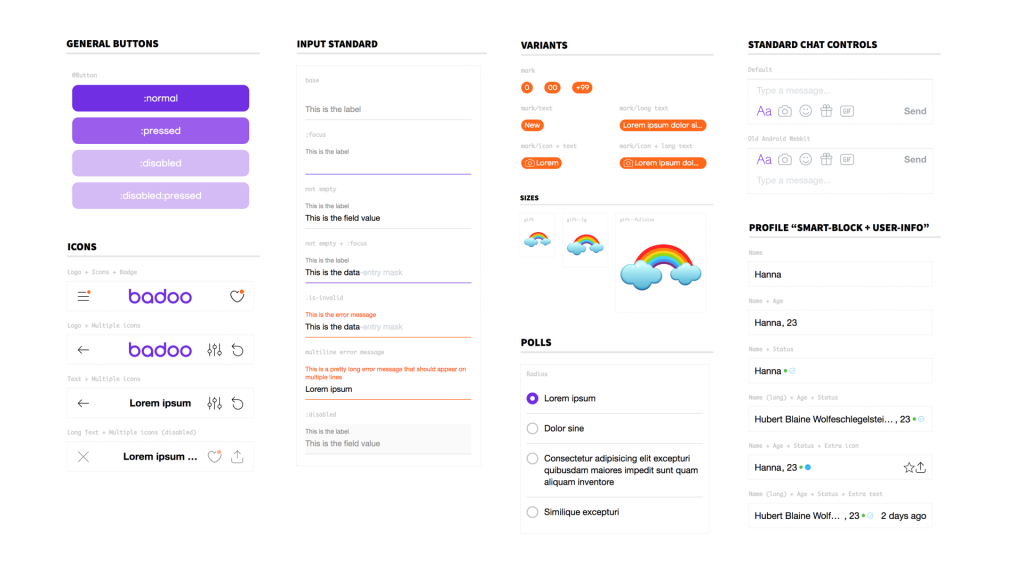
For the first time, there was a “holistic view” of the elements, of all their possible combinations, and it was “easy” for me and my colleagues to spot inconsistencies, detect side effects, and find duplications and common patterns.
We were the ones telling designers that sometimes their designs were not consistent, or there were similar UI elements that could be reused instead of creating new ones, or that they were not taking into account some edge cases or problems with different languages.
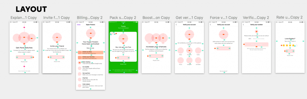
This, for example, was a ticket in which I required the designers to review their Sketch files in order to be able to reuse some components and have more consistency in two very similar features.
Despite me being such a big “pain in the ___” for them, this is something that the designers really understood and appreciated. This makes them honour and shows how smart and open-minded they are.
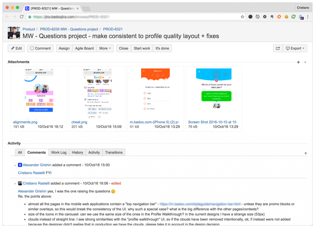
The style guide was a living style guide: the HTML template/partials and the CSS styling used by the style guide were exactly the same as the ones used by the application. Whenever a file was updated/changed for the application, the change was also automatically applied to the style guide, and vice versa.
The style guide was also covered by a suite of visual regression tests. For those who don’t know what visual regression testing (VRT) is, essentially it’s a tool that takes a screenshot of a page (or section of a page) before and after the changes, and compares them: if the tool detects a difference, it triggers an error and that test fails. If you want to know more about VRT testing, this is a nice presentation on this topic by Nikhil Verma.
All this allowed me to deliver business value from day one. As we shall see, this will represent a major breakthrough in the story.
People started to realise that the style guide, and the VRT testing, are just tools. (“It’s a tool” became a sort of meme in our discussions). Powerful tools that allow people to work better, faster, more consistently and predictably.
However, it’s very important that, in order to have people to adopt the tool, you share as much as possible the responsibilities and the ownership of these tools: it’s your kid, but let it go. It’s a tool … but don’t make it your tool: let other people help and contribute, even if they will “break” it.

It gets noticed
It was at this point of the story that the style guide started to get noticed.
Everyone was starting to see visible, tangible improvements: modularisation of components, reusability of code & components, increased speed of development, and a better visual consistency & overall quality of the application.
Probably nothing new for some of you, it’s all the classic shebang of a pattern library, no? But for many people in the company, it was something different, something not seen before (at least, not in this way).
Suddenly an idea started to gain traction: to create a shared component library, shared between the Mobile Web and the Desktop Web apps.
Together with my team lead, we decided to make a pitch (to the designers first and to the Desktop Web team later) to introduce this idea of a shared UI library for the development of web applications in Badoo.
During the pitch we highlighted the problems in the process we were trying to solve:
- the fact that both the designers and the developers were relying too much on copy&paste when developing the UI
- the absence of modularisation was leading to code duplication and the impossibility of reusing the code
- there were too many small differences and inconsistencies in the UI
- there was a problem of obsolescence in the Sketch files used by the designers, and they did not have a holistic view when designing or redesigning the product features.
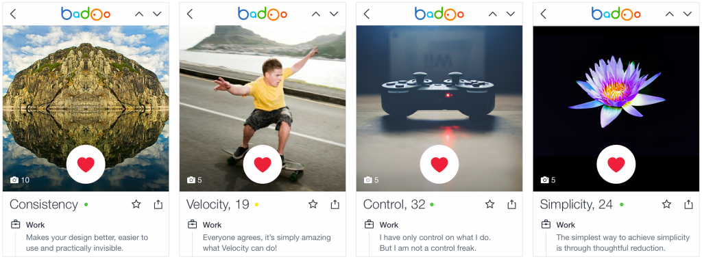
We showed what the benefits were, that we wanted to achieve:
- better consistency across applications/platforms and a more cohesive experience for the users
- improved velocity in designing/developing new features and shorter time to market
- systemic design approach and more control over what gets implemented (and how) in the UI
- a simplified, more efficient (and less error-prone) process for both the designers and the developers
The pitch was welcomed with enthusiasm, especially by the designers, and the answer to our proposal was a strong “Yes”.
So, we started to work on the project, prepare documents and long-term plans, and have meetings and discussions. Nothing could stop us at this point, right?
Well, not exactly.
The story continues here:
From zero to Cosmos — Part #2
From zero to Cosmos — Part #3
Originally published on Medium on February 5, 2018.