From zero to Cosmos — Part #2
Second part: here come the dragons, and where the “grand plan” takes place
This is the story of how a small style guide that was first introduced under the radar, became so appreciated by both developers and designers that it made its way to become a complex unification project — a design system called Cosmos.
From zero to Cosmos — Part #1
From zero to Cosmos — Part #3

The “Re-Think” project
But let’s start with the initial moment of crisis, the “dragons” in the hero’s journey.
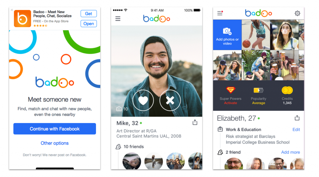
It was late 2016, and the “Re-Think” project appeared on the scene. This project consisted of a complete rethink, a complete overhaul of Badoo’s identity, of its brand, of its design language (here is a more detailed explanation of the project: https://www.behance.net/gallery/55344175/New-Badoo-identity).
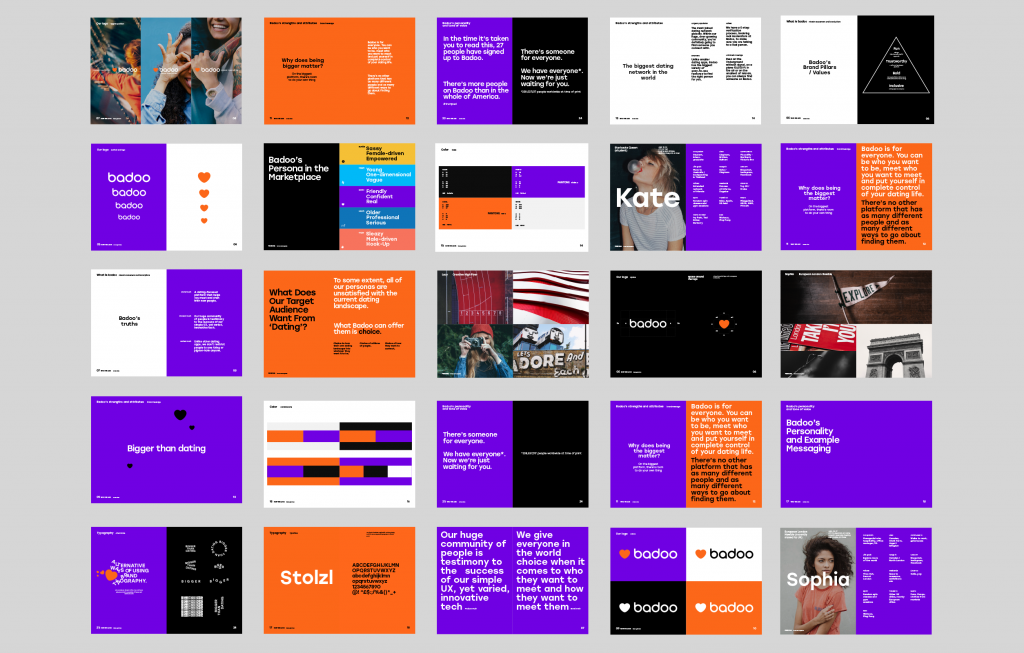
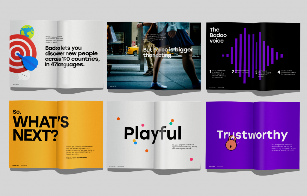
As you can see, everything was questioned and challenged: brand colours, fonts, photography, iconography, tone of voice, visual style. Everything.
This involved all our applications too, of course: the designers were asked to take an application that has already evolved many times over the years and redesign it from scratch.
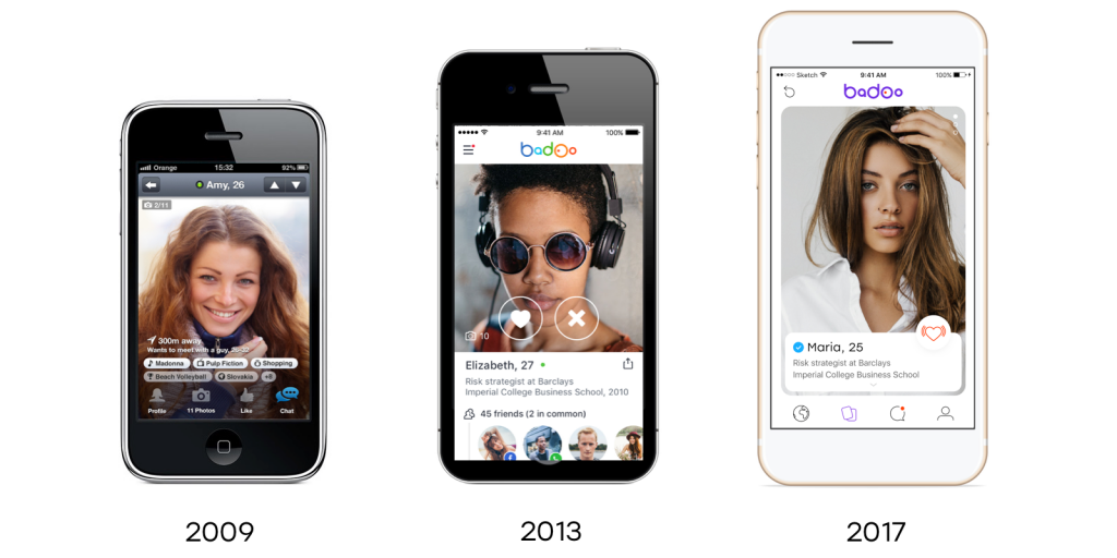
The result was really a complete re-think!
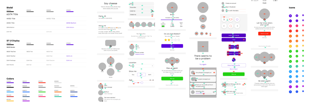
On their side, the designers started with the right approach: creating a library of components and “atomic elements” (fonts, colours, icon sizes, small UI components) and reusing them quite systematically across the new designs of the application.
I think we can all agree: in theory this is the perfect case for a style guide.
Can you imagine a designer changing or adding a component in that UI Sketch file, and immediately updating the style guide at the same time?
In practice… the source of all evils:
Because we had a fixed deadline (around two months) everyone rushed to write code, and everything which was not directly working on the new pages was regarded as a loss of time.
Not only that, but Re-Think was developed in its own, separate branch. This meant that while the UI of the application was evolving in that branch, the style guide living in the “master” world was not updated.
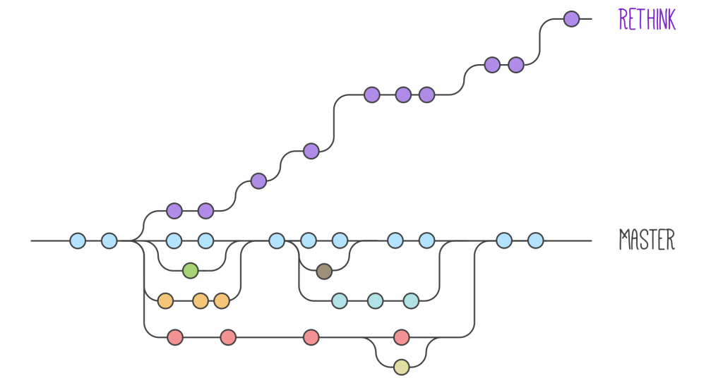
Within a couple of months, the style guide was a mess, in disarray, and not being maintained anymore:
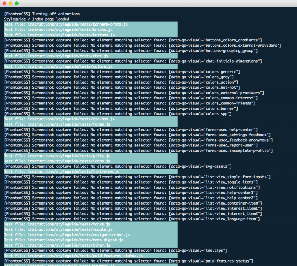
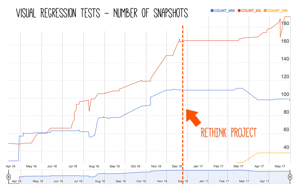
The components were broken or missing, the visual regression tests were in pieces and not added anymore.
We went from a living style guide to a dead style guide.
For me it was a “professional” crisis, and I felt it like a personal failure: I’ve not been able to convey and communicate the value, the importance & the true potential of a style guide, especially in this context. Maybe it was just a tool, but it was not fully understood.
I repeat: it was my failure, my fault. And I still think it is, under these terms.
At that point, the question for me was: “Why do we need to keep it alive?”. I asked my managers and my team this very same question.

Not everything is lost
But luckily, at least for me, not everything was lost. It was at this point in the story that I had two key moments of insight.
The first one was while I was reading an old, little book (it’s 40 years old!), called Systemantics, by John Gall. For me, it was a true revelation (if you want to know more about it, I’ve written an extensive post/review of the book here: https://medium.com/@didoo/systemantics-a778c4247cbb).
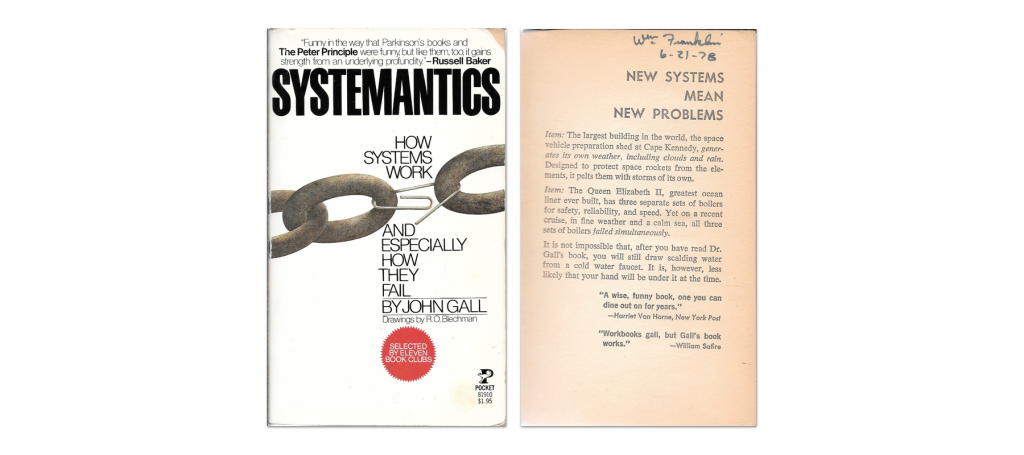
My aha moment was not, or at least not only, because of Gall’s law:
“A complex system that works is invariably found to have evolved from a simple system that worked. A complex system designed from scratch never works and cannot be patched up to make it work. You have to start over with a working simple system.”
That’s how evolution works, and that’s how life evolved from molecules and bacteria, to plants and animals (thanks Alla for reminding me).
It was this phrase that struck me:
Systems in general work poorly or not at all, or in other words failure to function as expected is an intrinsic feature of the systems.
All at once, I realised I was looking at the whole thing from the wrong point of view.
I was thinking about the style guide, about the design system as a perfect system, and always looking for the things that were missing to make it perfect.
Instead, I should have accepted this imperfection as an intrinsic feature of the system itself, and I realised that I should be looking at all the good things that were having a positive impact on the team, the product, the company.
The second key moment was when I received a crucial email message.
I was in Moscow, where I was working for a few days, and it was evening. While I was out, visiting Moscow with some colleagues, I received this email from Sasha Grishin, Head of Design in Badoo, with my manager in CC.
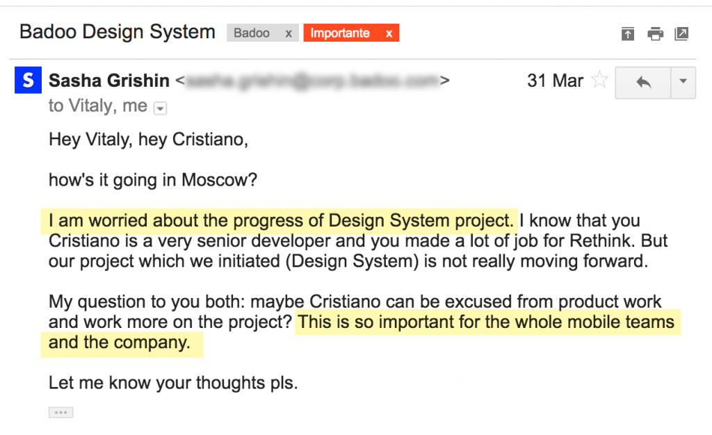
It came as a great surprise to me. I was expecting that the project on a design system would end up dismissed and forgotten.
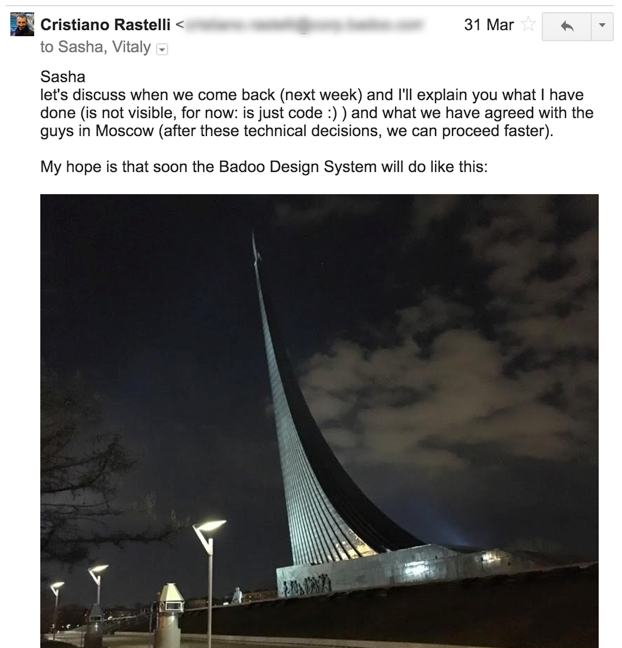
This was my response to him: “My hope is that soon the Badoo Design System will do like this” and I took a photo of the monument I had in front of me at that moment, which was the Monument to the Conquerors of Space, that represents a rocket lifting off.
In case is not clear enough: this is a designer telling a front-end developer to build a design system!
He wasn’t building a wall to protect his territory, saying: “this is design, stay out of here!” (read: “don’t piss on my lamp post”). He was understanding the value of my endeavour.
I thought about what happened for a few days, and then I took a decision: I had to seize the moment and use this big push from the designers to build the design system we had in mind. I could not afford to “lose” the designers.
When I came back from Moscow, Sasha asked me this question: “When can we see something? When can we share it with the other designers and teams?” and again he repeated: “It’s extremely important for the company”.
So, we arranged a meeting, a turning-point meeting.
During this meeting, we discussed the next steps to take, and Sasha came up with this definition of an MVP that he wanted from me:
A style guide built together with the designers, to serve as visual reference for the developers.
The idea was to build a design system for all our mobile applications (Mobile Web, iOS, Android, and Windows Phone at that time). We decided to leave out the desktop version, because the overlap between the UIs for the two contexts was minimal for us. This was our first, important decision.
The second decision, and it was a tough one at least for me, was to build the design system based on the “optimal/new/upcoming” design, not the design in production, with a codebase completely detached from the production code.
This have allowed the designers to refine and unify the existing UI, and to me to build the component library without the restraints (and resulting slowness) given by having to work with production code.
It was a tough decision, because of the previous painful experience with a “dead” style guide, and also because of what Gall’s law postulates.
But it was a “make or break” choice, so I took the risk.
And this is where the grand plan took shape.
First of all, I organised a meeting with the other mobile web developers to show them what the plan was and collect their feedback and ideas.
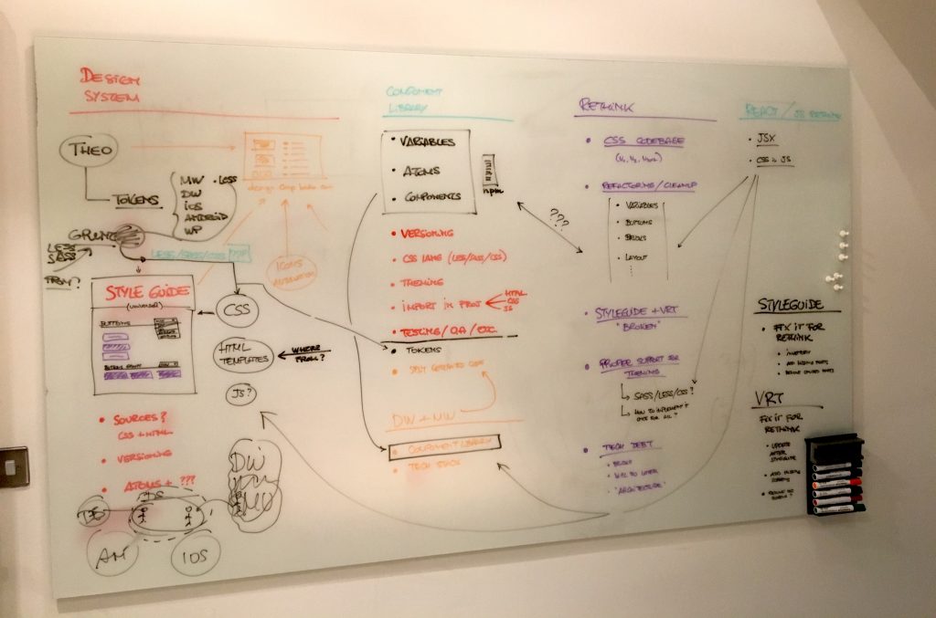
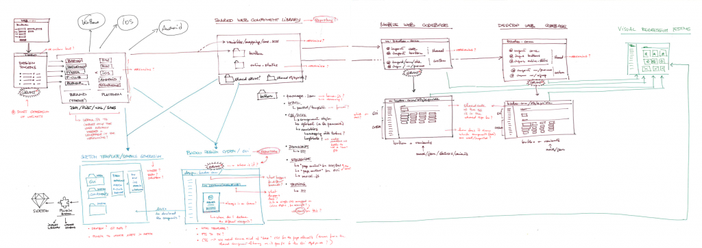
This was then translated into this grand schema, that involving design tokens for all the platforms, the creation of a shared component library, the automatic generation of Sketch files and libraries to be used by the designers, and the development of multiple style guides.
There’s actually nothing innovative or groundbreaking about it: more or less, all of us who are working on a design system, are in search of the same “Holy Grail”: a cross-platform, cross-disciplinary design system.
This amazing post by Mark Dalgleish highlights and summarises this idea, if you want to understand more about it: A Unified Styling Language.
But… how can this be possible? Well, by using the “code” as the source of truth. Look at this example of code (taken from one of Mark’s slides):
import {
  PageBlock,
  Card,
  Text
} from 'seek-style-guide/react'

<PageBlock>
  <Card>
    <Text heading>Hello CSSConf EU!</Text>
  </Card>
</PageBlock>
Is this HTML? Is it React? Maybe React Native? What if we could simply look at this code as an abstract, universal, semantic description of a UI?
Now, this idea of an integration between the developers’ and the designers’ tools using code as source of truth for both was pioneered by Jon Gold at Airbnb, with his efforts to create a library –more correctly, a renderer– that takes React (Native) code as input and automatically generates Sketch files as output:
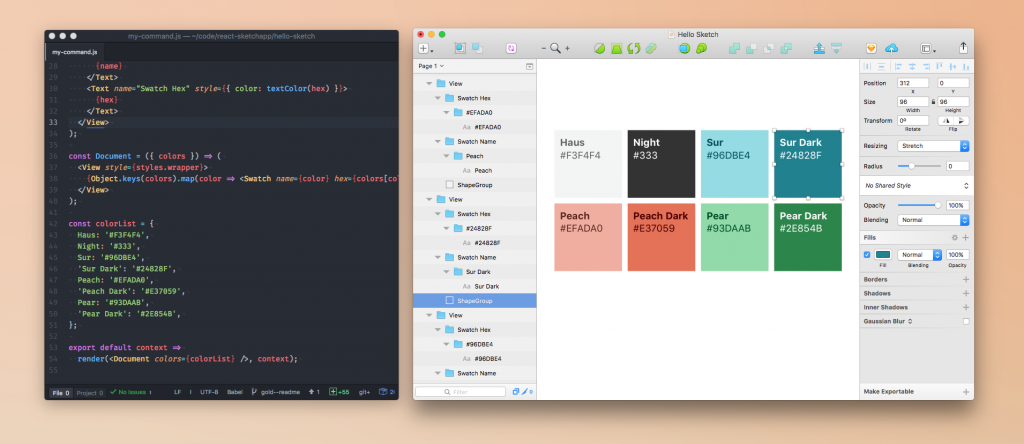
You can learn more about the thinking behind this project, the problems they are trying to solve, and the technical solutions they have found, in this article that Jon wrote a few months ago: Painting with Code – Introducing our new open source library React Sketch.app.
Jon’s innovative (and invaluable) work has paved the way to a lot of new tools–both open source as well commercial solutions–that promise (and in some cases allow) us to finally bridge this gap between designers and developers using the code as the source of truth (“the real thing”). I am thinking of tools like Airbnb’s Lona, Compositor Lab/Iso, Alva, html-sketchapp, and others that embrace the same philosophy.
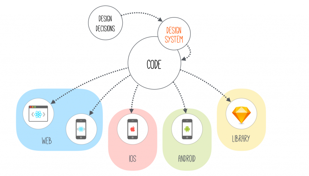
In other words, we are finally moving away from the myth of using design tools to generate code…
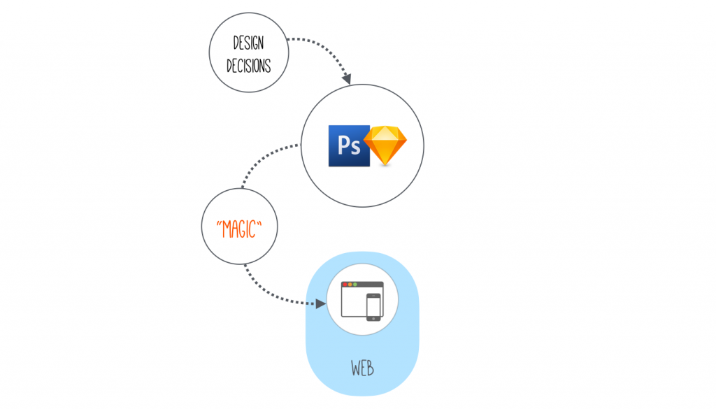
…in favour of tools that can take “universal” code and generate different output formats for different platforms, targets. Even for the tools used by the designers (in particular Sketch).
In this way, the design system becomes the bridge that connects the design decisions and the universal code.
Once again, Mark Dalgleish is the go-to-person if you want to know more about this idea of “breaking down the technical walls between design tools and the underlying code”: Sketching in the Browser.
One last missing piece was the name.
We were calling it “Badoo Design System” but no one really understood what it was, apart from the narrow circle of people actually working on it.
I realised that we needed a name.
So, I started to look for a name, but I couldn’t find anything meaningful or interesting. We know, naming things is hard. Until I remembered where everything started: that email in Moscow!
That monument you saw before in the email is the Monument to the Conquerors of Space, or ‘cosmonauts’.

So, I thought that maybe “cosmos” could have been a good name. I knew it was a Greek word, of course, and that today we mean “universe” with it, but I was not sure of the exact, original meaning, so I looked for the etymology of the word and to my great surprise, I found out that actually the meaning was…
Cosmos — from Latinized form of Greek cosmos “order, good order, orderly arrangement”; a complex orderly self-inclusive system, an orderly harmonious systematic universe.
Perfect! And we had also an emoji — this one: 🚀 — for free! :)
The story continues here: From zero to Cosmos — Part #3
Originally published on Medium on February 14, 2018