From zero to Cosmos — Part #3
Third part: where I show where we are today, and where we think we will be in the future
This is the story of how a small style guide that was first introduced under the radar, became so appreciated by both developers and designers that it finally became a complex unification project — a design system called Cosmos.
From zero to Cosmos — Part #1
From zero to Cosmos — Part #2

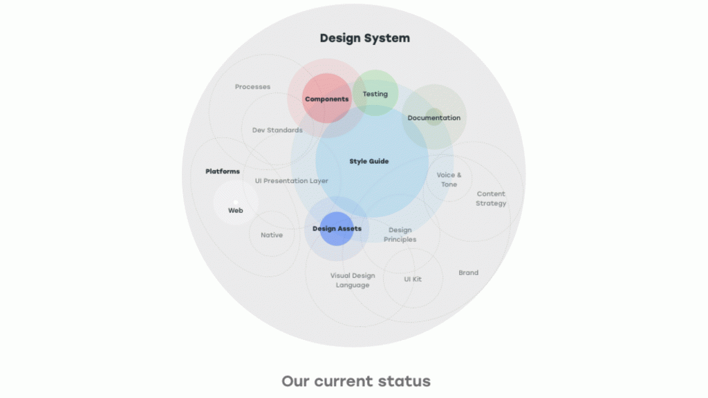
Today
Fast forward to today, a few months later, what has happened?
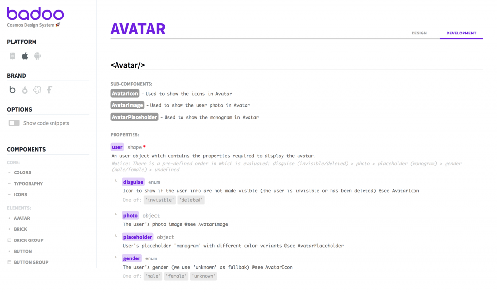
Our technical stack is pretty simple and “standard”. We are using a list of core design tokens processed with Theo. We are using React, because we have found it’s perfect for building UI components in the way we want to. On the CSS side, we are still relying on Sass and BEM for now: we have postponed the decision until we have a clearer idea of which approach we want to adopt (just BEM? Styled Components? CSS Modules? Something else?).
Regarding the organisation of our components (the “Atomic conundrum”) we have decided to follow what people smarter and with more experience than us — Jina Anne, Nathan Curtis, Trent Walton, Adam Morse, and many others– are suggesting: “Everything is a component” (of course, what they mean is: “treat everything as a component”).
That’s why, in the code repository we have a flat folder structure, with each component organised in its own folder, and in the style guide we have all the components arranged under a flat organisation structure too:
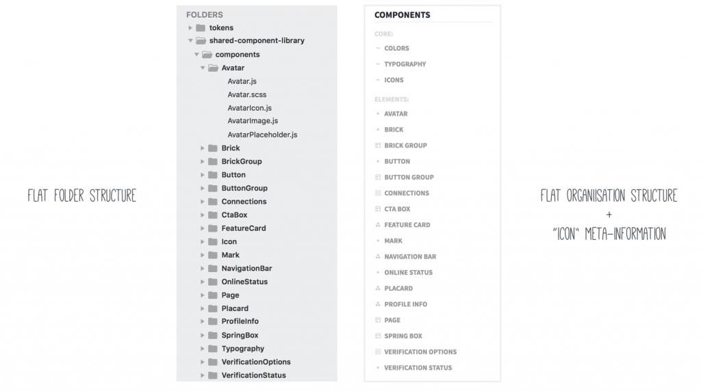
However, we have added an “icon” to the list of components in the side navigation of the style guide: these icons act as decoration, but are also used as meta-information to identify the kind of components you are looking at:
During this process of component organisation and categorisation, I made a couple of interesting (and for me unexpected) observations.
First of all, I realised that in general there are two distinct kinds of component: those that are pure layout, and those that are content (and decoration).
A “layout” component is used to control/organise the layout of some generic content. A “content+decoration” component consists only of some content and its visual decoration, where its layout will be controlled by the parent container in which it will be inserted.
In a similar way, whenever there is a list-based component, the list and list-item sub-components are always pure “layout” components, while the actual content (with different variants) is organised by the list-item “layout” container element.
The second thing that I noticed is that, coming from a background of “classic” CSS development, whenever I was building a component I was tempted to “go up” (using inheritance from the parent) or “sideways” (trying to cover too much with a single component). But in a component-based world, components live in isolation, and there is no such thing as “context”.
Now, whenever I see something that shows hybrid traits, it’s a hint that the component should probably be broken down into smaller components. So, my rule is: when in doubt, break down a component.
We have introduced some very raw/qualitative metrics to keep track of progress in:
- the number of components and subcomponents added to the system
- the lines of JSX code we have written to build them
- the number of visual regression tests added to cover the style guide.
For example, within six months (from 1st July 2017 to 1st January 2018) we went from 9 to 79 components and sub-components, from ~200 to ~3500 lines of JSX code, overall from ~1200 to ~14000 lines of code. In a similar way, we went from zero Visual Regression tests to more than 100 tests (and we have 100% coverage of the entire Cosmos style guide now).
With the designers, we are in a phase of great collaboration with a fast feedback loop: they decide to change something, we discuss the changes they want and a couple of hours later these changes are already applied to Cosmos; if we notice that there are some inconsistencies or too many variants in a component that we are developing, we just sit down together, we agree on the “design rules” for that component, and then we apply them to both our code and their designs.
This improved communication channel is an expected result of the introduction of a Design System, but seeing it first-hand is amazing and heart-warming. Whenever one of us has a doubt or a problem, it’s so much easier to just get up, go to someone else’s desk, have a quick 5 minute chat, and agree on what to do. In that sense, having a shared language, vocabulary and nomenclature, turned out to be vital.
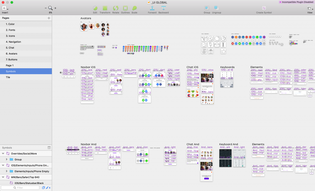
On their side, the designers are going through a UI inventory, across all the application screens, collecting all the elements in a Sketch library, and reducing the number of cases, options and variants.
The result of this process is a centralized Sketch library file, that contains (or better, will contain) all the styles and all the components of Badoo’s UI.
Taking advantage of the Library Symbols in Sketch, the components and styles defined as symbols in the library can be used across every file that they decide to create or modify. Whenever they are updated in the library, they are also updated in the documents that use them.
In this way, they have followed the same single source of truth model that we have with the shared component library in our codebase, only this time it is in Sketch. The long term goal is to have these library files generated automatically by the code, but for now this is already an unbelievable achievement, and we can start to build on that.
Now that they have introduced this “shared UI library”, the designers have also decided to introduce a “compliance with Cosmos” criterion into their weekly design reviews: this means that if some of their new/updated designs don’t follow the patterns and use the components of the shared library, they will not pass the review. Isn’t that great?!?
It’s important to stress that all these changes in the designers’ approach, in their workflow and processes, were not pushed, not required, and not even suggested by me: they were taken autonomously, on their own. It’s the power of a Design System, the power of pull (drive the way, show the benefits) vs. push (tell people what to do, dictate rules and set down prescriptions).
And this is the result: this really happened! I could not believe my ears!

Show time!
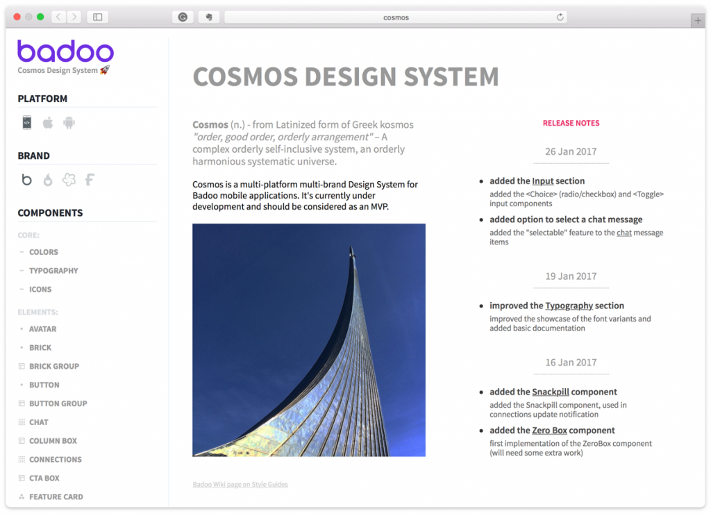
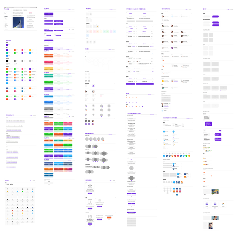
At this point in the story, it’s–finally!–time to show you the real thing.
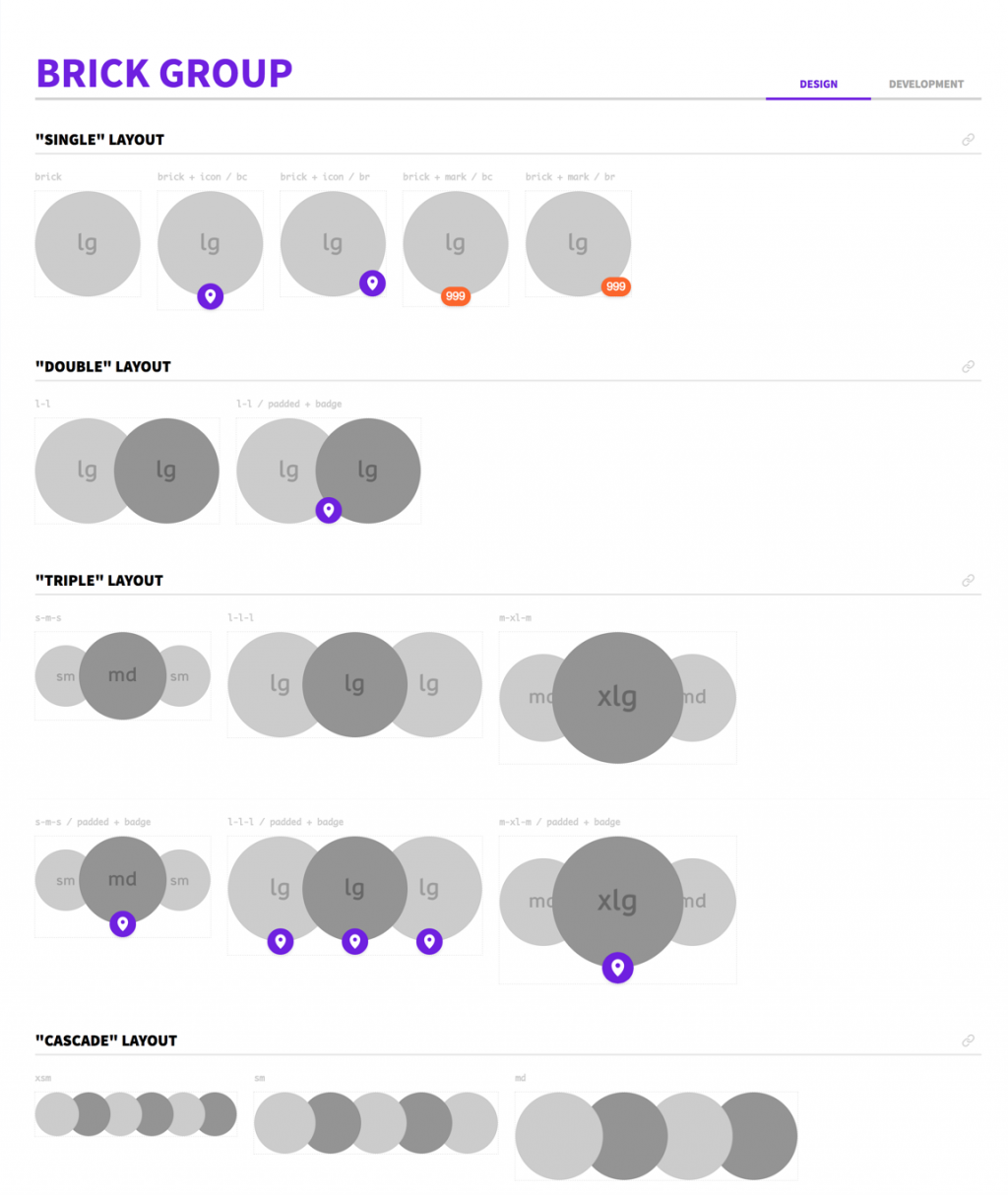
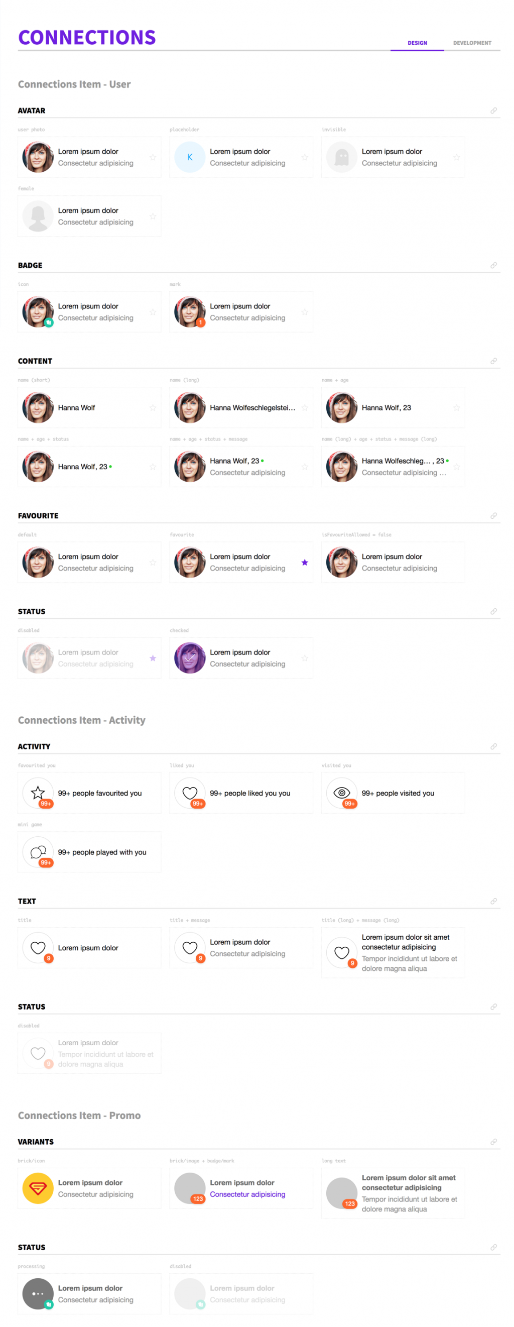
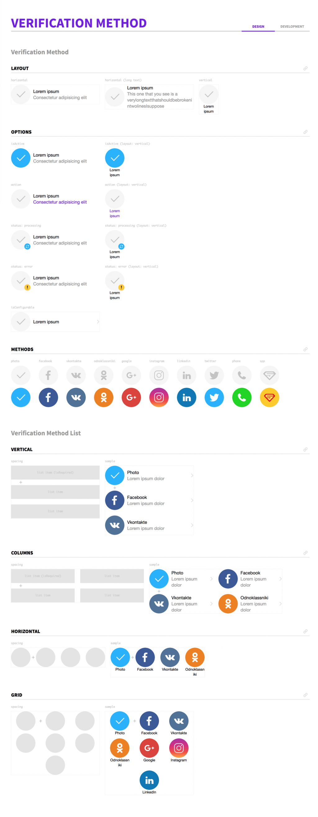
The style guide is not (yet) available online, but you can have a sneak peek at some of its pages below. Keep in mind that our style guide is not something that will blow your socks off :) it’s one of the many out there: it’s “just” a collection of UI elements organised in a website.
What I think is interesting is the way we present the components.
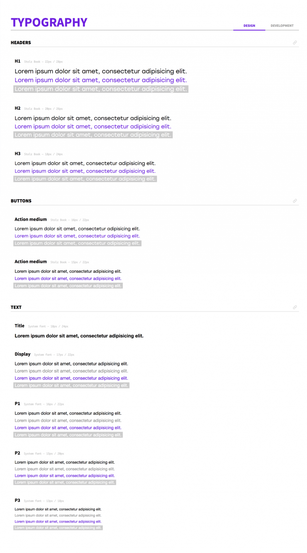
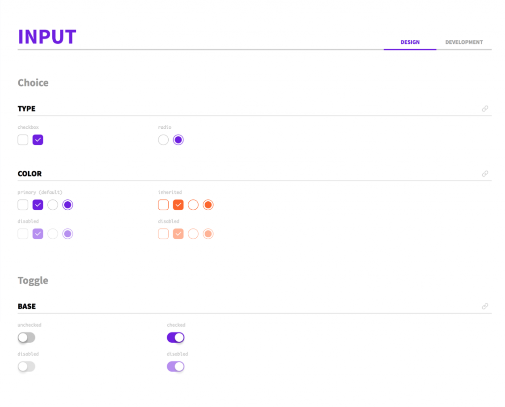
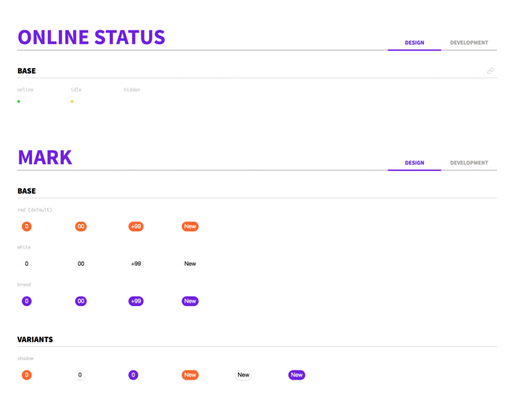
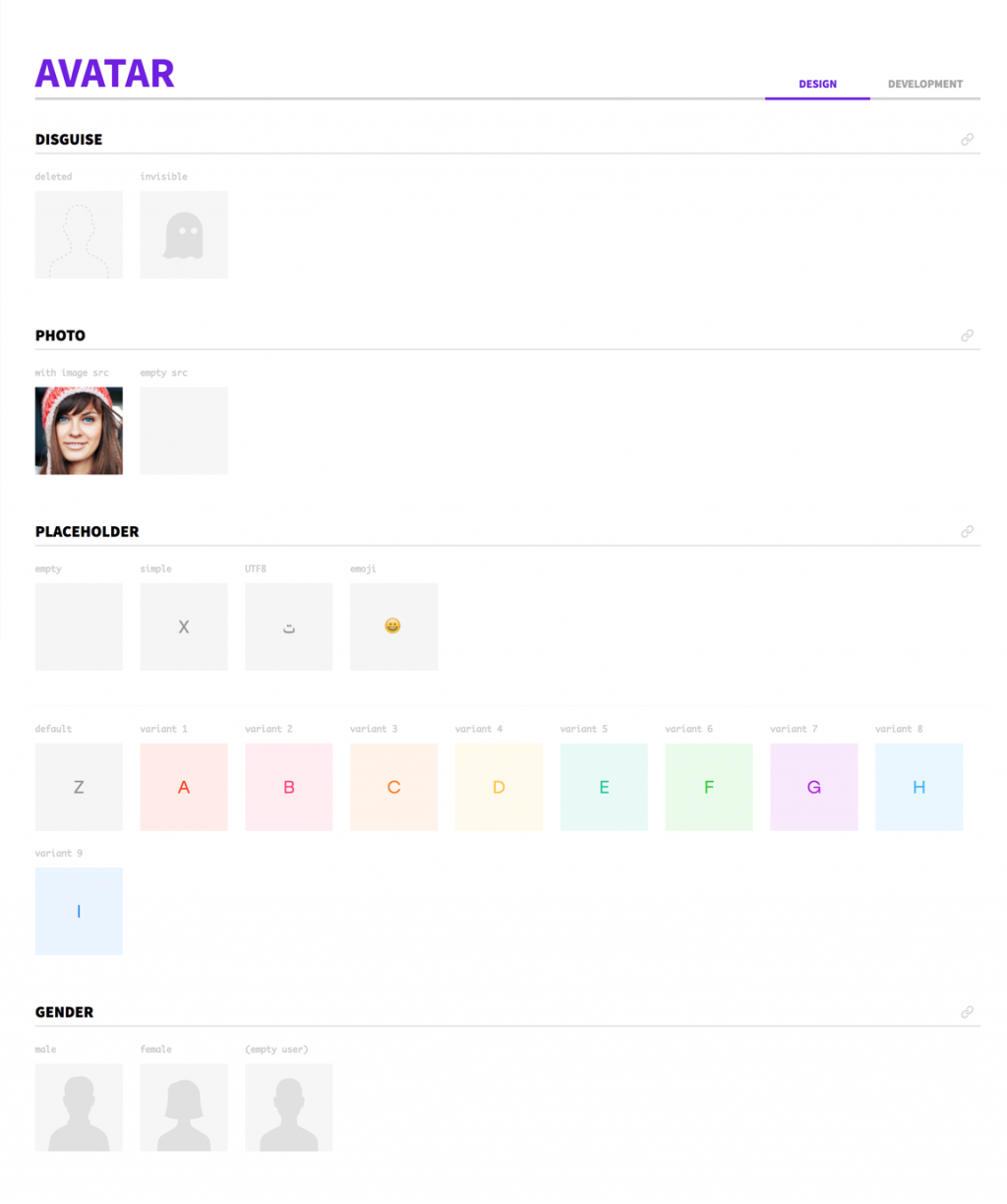
For each component we show all the possible options, variants, statuses, and combinations. Particular attention is paid to highlight the behaviour of the component in edge cases, like extremely long or extremely short text (Badoo supports more than 50 different languages!), unforeseen combinations of different components, spacing around the component or between list items, and so on.
We have also the ability to change platform and brand (white-label) and see how the same component renders with different design tokens (they may be different for different platforms and/or brands.
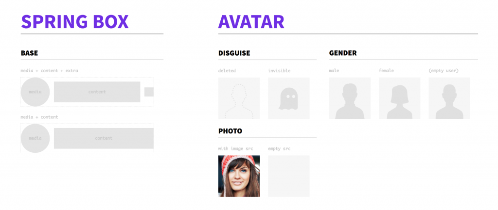
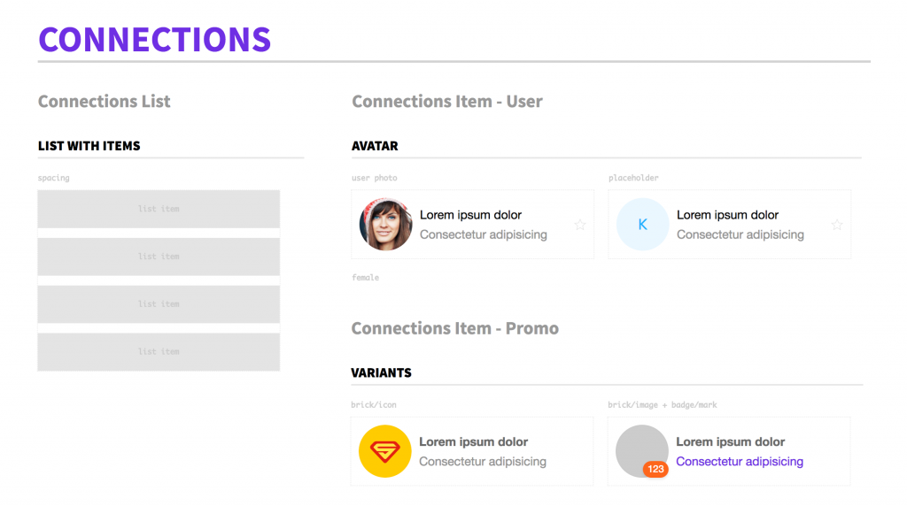
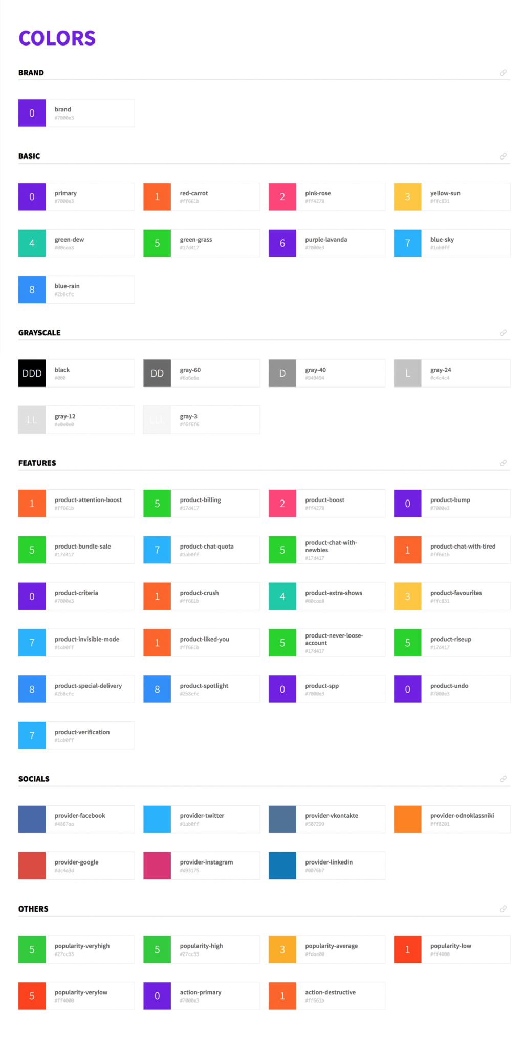
So, here are some screenshots of our Cosmos style guide:

Looking forward
Now, looking forward (and trying to predict the future) what are the next steps and the next challenges?
Currently we are focused on these short-term objectives:
- Components
We want to further increase the coverage of the user interface with the Cosmos component library, adding more and more components to it. - Platforms
We want to significantly increase the use of Cosmos components in the Mobile Web application and have other platforms (iOS/Android) start minimal integration with it (design tokens, at least). - Documentation
We absolutely need to improve the documentation for the components, and in particular its automatic generation. Now it’s done manually, and it requires a lot of effort for the developers of components (this turned out to be the greatest pain point for them). - Process
Not all the developers in the team are currently using Cosmos or know how to use its components, so we need to involve and onboard all the other developers of the Mobile Web team.
Below you can see a visual representation of these objectives:
In the medium term, we’ll have to tackle some puzzling technical challenges:
- A/B testing
How do we do A/B testing, and where? In the component library itself or in the application “consuming” the components? - Animations
How do we introduce animations in the library? I mean, beyond the basic definition of design tokens for transition-functions and timings; and how do we take into account different devices’ capabilities, in that case? - Versioning
How do we version the component library? One single version for the entire library, or distinct/independent versions for each component? And how should we define minor/major/breaking changes? - CSS
Which CSS architecture/library should we adopt? As mentioned above, we are considering BEM/Sass, CSS Modules and Styled Components, but each one of these comes with pros and cons, and in any case, this is a decision that would impact the developers’ experience, affecting many of us, so it can’t be taken lightly.
For now, on these issues we are following the principle of last responsible moment, but sooner or later we’ll have to take a binding decision.
Finally, we need to look at more high-level long-term challenges that are waiting for us further down the line:
- Team and process
We need to define a more “formal” team structure and a more solid process. For now, everything is delegated to a restricted number of people directly involved in the project, so it’s easy to keep things under control, but as soon as the number of people involved/impacted grows, we need to have in place some form of organisation and control of the flow design/development → integration → testing → production. - Native platforms
The native platforms, especially the iOS team, have already started to build their own component library, but it is completely disconnected from the Cosmos component library, so we have to consider technological solutions like React Native, or otherwise have processes in place that allows us constantly to keep the different component libraries used for the different platforms updated and in sync. - Business/Management involvement
This is definitely the most challenging and delicate aspect of the making of a Design System. As someone mentioned recently, a Design System is an engineering solution to a design problem. True, but let’s not forget that first of all and foremost, a Design System exists with the purpose of serving a business or a product, and it impacts a whole company, not only its tech/dev teams.
So, considering the results we have achieved until now, there’s a bright future in front of us, but a lot of work still needs to be done. Only the future will tell if this will be a success or another confirmation of Gall’s law 🙂.
Conclusions
These are the my takeaways, the lessons I’ve learned on this long journey:
- You can’t push change — you have to deliver value first
- Go under the radar — if your company is not working on a DS already, or you don’t have commitment from the top.
- Learn from others — but then take risks and make your choices based on your context, business needs, limitations, etc.
- Be prepared to fail — because every system fails, it’s in its very nature.
I want to leave you with this quote, that I read on a wall of the Design Museum in London a few weeks ago:
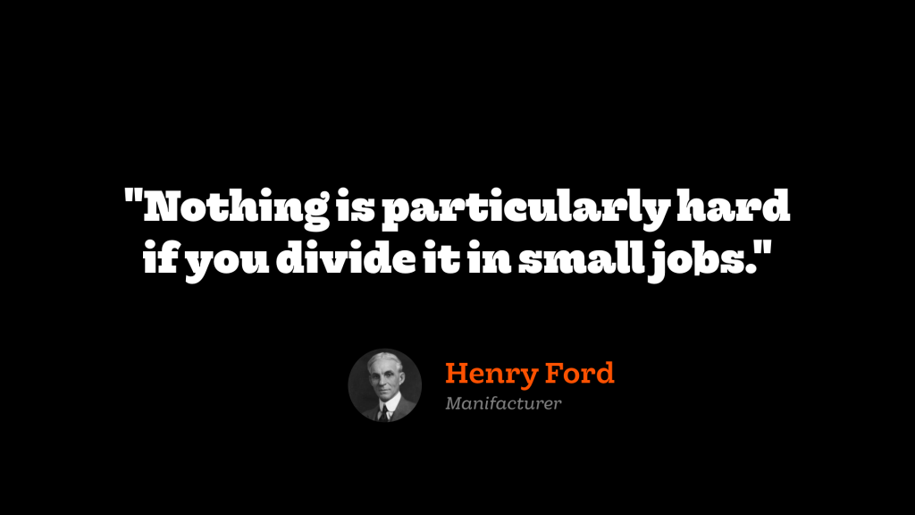
Henry Ford — Manufacturer
Slides & Video
These posts are the extended version of a talk that I’ve given at two meet ups (Konect and WEBdeLDN). Here you can find the slide deck of the talk:
Links and references
Here some useful links and references mentioned in this article:
- A Unified Styling Language
- Painting with Code
- Atomic Design Methodology
- Living Design Systems
- On Classification in Design Systems
- Atomic Classification
- UI development as a first-class citizen
- Team Models for Scaling a Design System
- Anatomy of a Design System
- Systemantics – John Gall (review)
- Visual Regression Testing — From a tool to a process
- New Badoo Identity (Project Rethink)
- React-Sketchapp
Originally published on Medium on February 22, 2018