Keep it simple, stupid!
How one line of CSS code saved me hours of React development
Yesterday I was trying to solve a problem while building the style guide of Cosmos, the Design System that we have developed in Badoo (you can read more about it here here and here).
I was developing a UI component called “Page”. Essentially is the root component of a mobile web application. It has a main area that fills the viewport horizontally and vertically, and some sub-elements/containers with a fixed position (the tab-bar navigation, a modal overlay, the notifications).
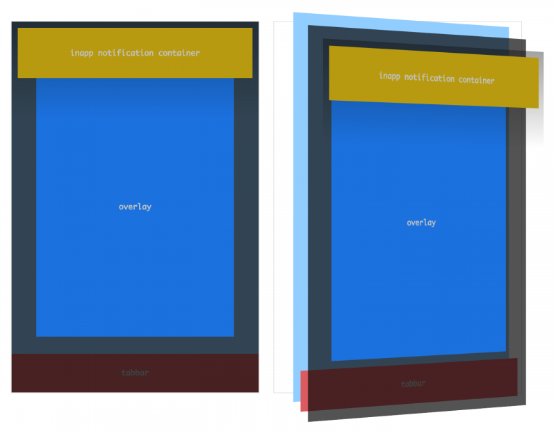
The visualisation of the “Page” component and its sub-components.
The problem I had is that, in order to obtain this layout (that fills the entire viewport and has overlaying elements that remain fixed when the user scrolls the page) I need to use position: fixed in the CSS. Unfortunately this means that, when you showcase the component in the style guide, the “fixed” elements will overlay and fill the entire page!
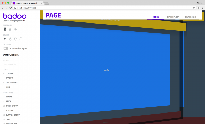
This is the result of having elements with position fixed and 100% width and/or height.
So I started to think about a solution. In a previous implementation of the style guide (which was just a static HTML website) I solved a similar problem using a simple function in JavaScript that would replace specific DOM nodes in the page with an iFrame, having then the DOM nodes injected back in the iFrame body via the contentDocument property.
But now the Cosmos style guide is built using React component, and is a React application itself. And we all know that React and “DOM manipulation” are not best friends :)
So I started to think to how to create an <IFrame> component that could do the same “magic trick” as before.
Also, to add another level of complexity, now the style guide has the option to change dynamically the CSS applied to the page, to take in account different design tokens for different platforms (Mobile Web, iOS, Android) and white labels. How could I update the content of the iFrame’s <head> element using the React lifecycle?
The more I was thinking, the more I realised it was not so simple as before. Looking online at existing solutions to get some ideas, I’ve found that in general they were using quite complex workarounds. Some of them were using Shadow DOM while others were relying on React Portals.
I started to collect code snippets, links about interesting pages and examples, documentation about React Portals, everything that could have been useful.
My evaluation of how much it would have taken me to build this <IFrame> component, with all the needed functionalities, was in the 2-3 hours range (to do it properly, not just hacking something around).
But just when I was about to open the code editor and prepare myself for this challenge, my right brain of CSS developer kicked in, and like a vision I realised that I was looking at the problem from the wrong point of view.
What really I wanted was simply to isolate the position: fixed effect to a specific container. Now, in CSS there is a (not very well known) side-effect of the Transform Rendering Model that does exactly what I was needing.
According to the W3C specs of the CSS Transforms Module:
Specifying a value other than none for the transform property establishes a new local coordinate system at the element that it is applied to. The mapping from where the element would have rendered into that local coordinate system is given by the element’s transformation matrix. Transformations are cumulative. That is, elements establish their local coordinate system within the coordinate system of their parent.
Usually this “strange” behaviour –which is not a side-effect, of course, it’s an intended spec– hits you when you apply a transform to some DOM nodes and suddenly all the z-index order is messed up (the reason is that the CSS transformation results also in the creation of a new stacking context).
In this case, having a coordinate system based on the parent container was exactly what I was looking for. It was just a matter of applying a translate3d transformation to the style guide element used to contain the component:
That’s it! As simple as one line of CSS code, this is the final result:
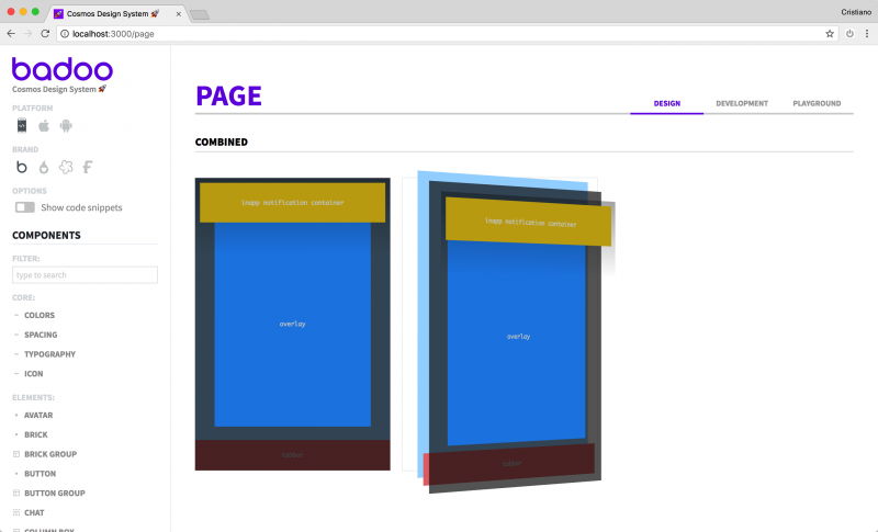
Now the position elements coordinates and box sizing are relative to the container element, not the full page.
The lesson in all of this: sometimes the solution is just under our nose, but we are too focused on taking the hammer and “fix the problem” with a ton of code. Next time this will happen, stop for a moment, turn on your lateral thinking and imagine if there is a simpler (and often more elegant) solution.
If you want to see the code and play around the CSS properties to see how a simple line of code affects the local coordinate system, here is the codepen I have used to develop the 3d visualisation of the stack of the UI elements: https://codepen.io/didoo/pen/MVPWBM?editors=1100